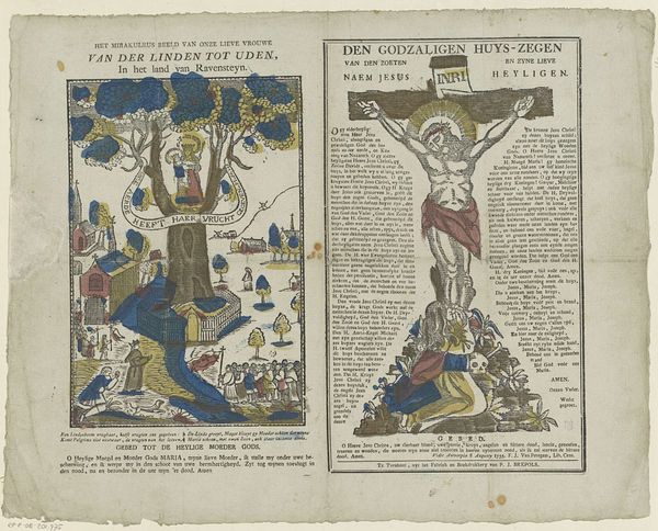
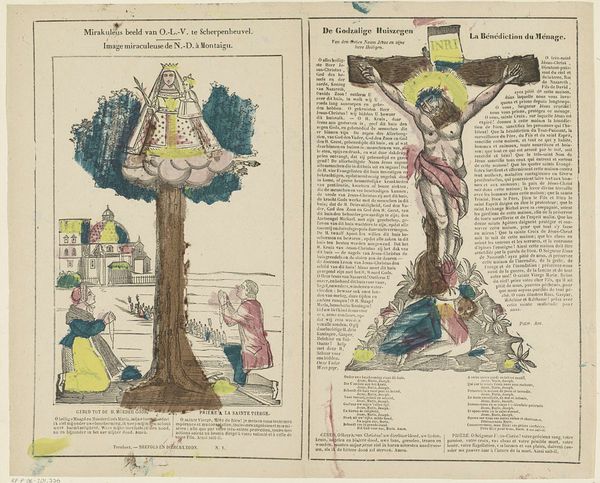
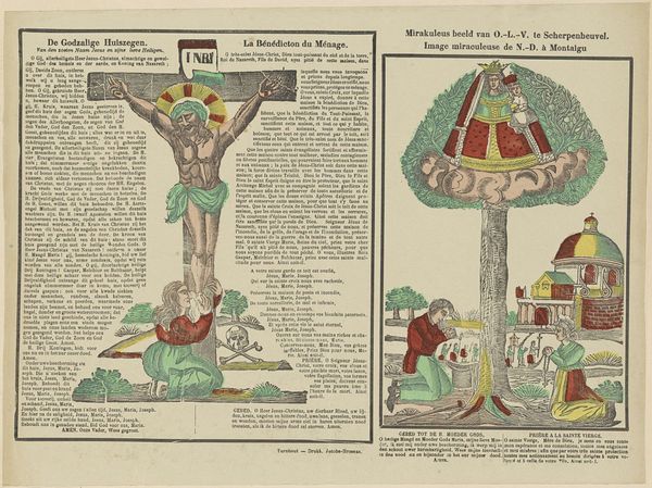
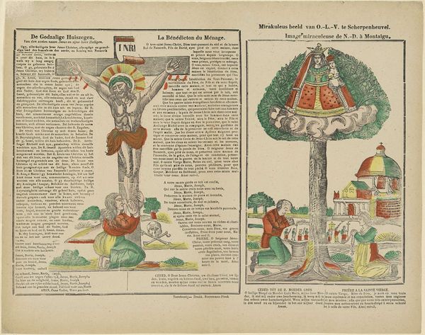
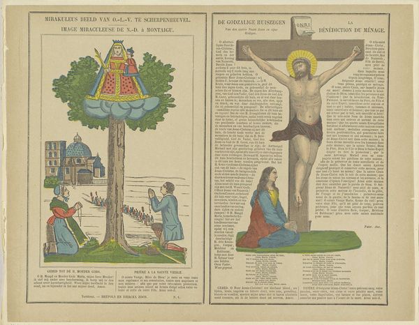
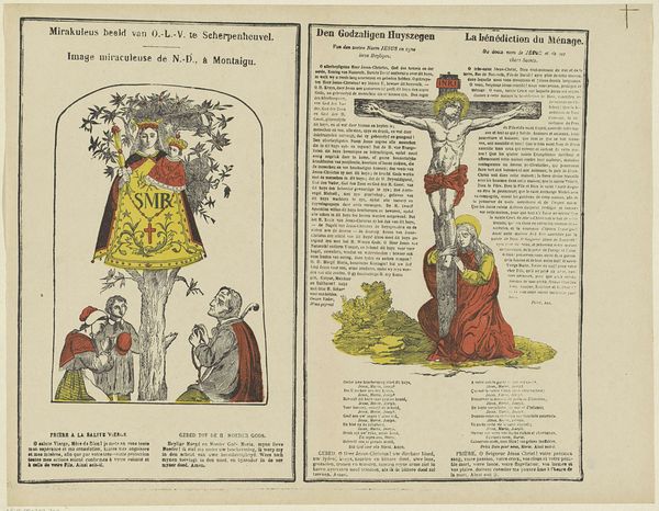
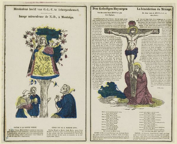
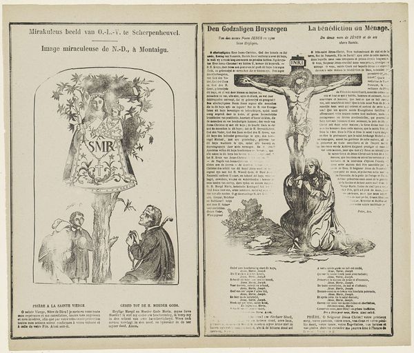
Het mirakuleus beeld / Van onze lieve vrouwe / van der Linden tot Uden, / in 't land van Ravensteyn / Den Godzaligen huys-zegen / van den zoeten / naem Jesus / en zyne lieve / heyligen 1800 - 1833
0:00
0:00
philippusjacobusbrepols
Rijksmuseum
print, engraving
#
narrative-art
# print
#
old engraving style
#
traditional media
#
landscape
#
folk-art
#
history-painting
#
engraving
Dimensions: height 338 mm, width 397 mm
Copyright: Rijks Museum: Open Domain
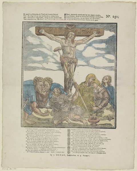
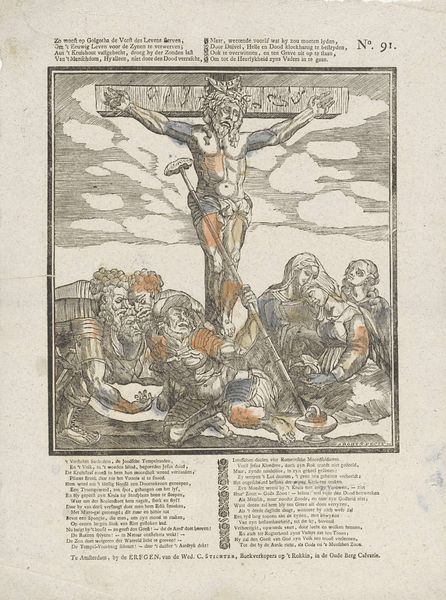
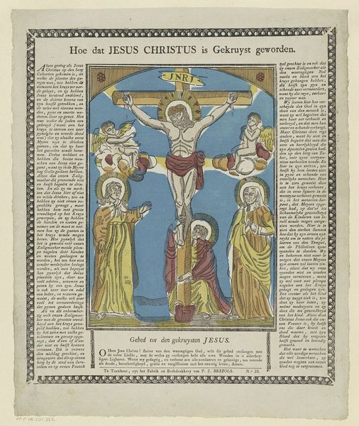
Editor: This engraving, dating from 1800 to 1833 and titled "Het mirakuleus beeld" by Philippus Jacobus Brepols, features a fascinating dual composition, almost like a diptych on paper. I'm particularly struck by the contrasting imagery – a serene, almost folk-art depiction on the left, and the more dramatic crucifixion scene on the right. What visual relationships do you see between these two panels? Curator: The visual relationship is structured primarily through the bilateral symmetry across the printed page and how that page presents these stark representational modes, with the material support emphasizing a thematic contrast. Note the use of linear perspective in both, yet to distinct ends. The left employs a simplified plane to represent the "mirakuleus beeld," flattened to amplify devotional significance, whilst the right displays a dramatic Baroque composition. The formal interplay foregrounds not a unified narrative, but rather opposing stylistic and theological viewpoints of this folk tradition. How does the flatness versus depth influence your understanding? Editor: I hadn’t considered it that way! The flatness almost invites interaction with the devotional aspects on the left, like it’s a tangible, approachable miracle. Whereas the depth on the right seems designed to create distance and awe toward religious figure, a spectacle. Curator: Precisely! This contrast invites us to investigate the composition—and material composition as a printed engraving—in communicating distinct emotional registers and purposes for a religious artwork. The use of the engraving supports dissemination in domestic devotional sphere versus high church tradition. Editor: I see. So by looking at the techniques and form, we can grasp the varied purposes. Curator: It reframes our understanding, seeing beyond just historical depiction to appreciating formal intentionality. This challenges a viewer’s expectations about religious presentation through printing practice and a distribution of aesthetic priorities. Editor: That's given me a fresh appreciation of this piece – thinking about it formally has unlocked layers of meaning I hadn't even considered!
Comments
No comments
Be the first to comment and join the conversation on the ultimate creative platform.
More like this