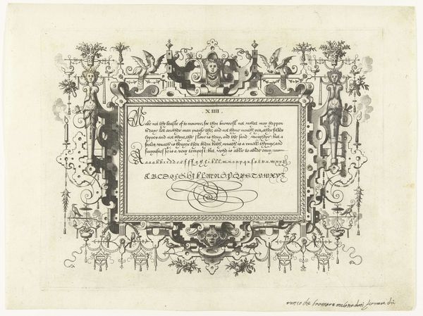
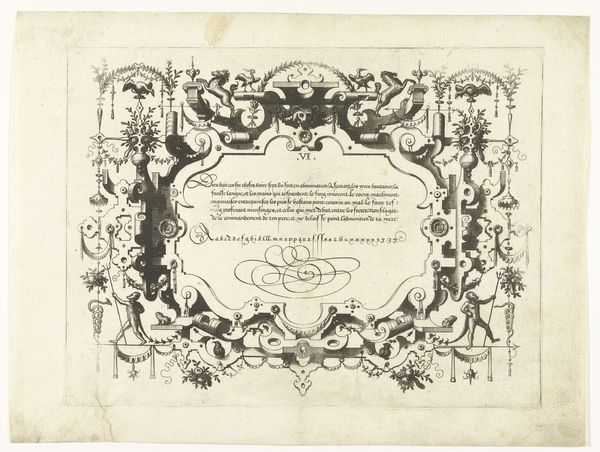
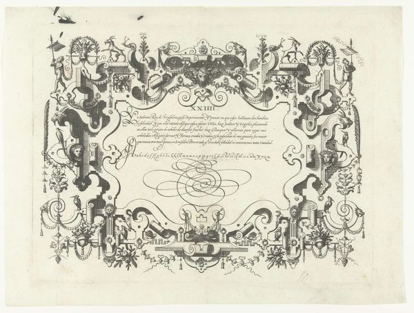
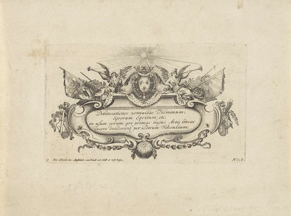
Cartouche met kalligrafie, links- en rechtsboven een man met vaandel 1569
johannesoflucasvandoetechum
Rijksmuseum
drawing, print, etching, ink, engraving
drawing
pen drawing
pen illustration
pen sketch
etching
old engraving style
figuration
ink line art
ink
pen-ink sketch
pen work
sketchbook drawing
coloring book page
engraving
doodle art
calligraphy
Dimensions: height 216 mm, width 284 mm
Copyright: Rijks Museum: Open Domain
Curator: Look at this intriguing piece, an etching created in 1569 by Johannes or Lucas van Doetechum, currently held at the Rijksmuseum. It's called "Cartouche met kalligrafie, links- en rechtsboven een man met vaandel". The whole piece is brimming with intricate details. Editor: It’s visually arresting. All of these details—the flourished lettering, the figures wielding banners—creates a feeling of organized chaos, somehow. Almost a restrained explosion! How was it produced? Curator: Well, as an etching, it would have involved coating a metal plate with a waxy resist, then drawing through it to expose the metal. Acid would then etch away at the exposed areas, creating grooves to hold the ink for printing. We need to appreciate this laborious manual work here! The tools, the acids, the ink and paper. Editor: Right. It's the slow burn of creativity—the resistance between the hand and the materials! And all these precise, delicate lines. Was calligraphy a popular artistic form then, or was it more functional? Curator: A little of both, actually! Calligraphy held significant social currency. Think of illuminated manuscripts, for instance—writing wasn't just about conveying information; it was about visual artistry. There's a beauty here but also, likely, the need to conform to established aesthetic conventions and tastes to appeal to patrons. The artist, or engraver rather, walked the narrow path between skill and labor, craft and expression. Editor: Absolutely, it gives off an essence of pure skill and craft! Look how they frame the text with almost playful elements! Men with flags, baroque flourishes. Do you read it as simply decorative or do these images add an extra layer of meaning? Curator: A bit of both I'd suggest. Calligraphy elevates text, giving even basic words, alphabets in this case, a formal presentation. The added visual motifs around the edges enrich the impact but it is all held in tension to convey meaning and aesthetics in equal measure. Editor: I see your point. The combination gives a lot to savor: the interplay of written form and symbolic ornament, the texture of the etched lines themselves... A powerful testament to the engraver's craft!
Comments
No comments
Be the first to comment and join the conversation on the ultimate creative platform.