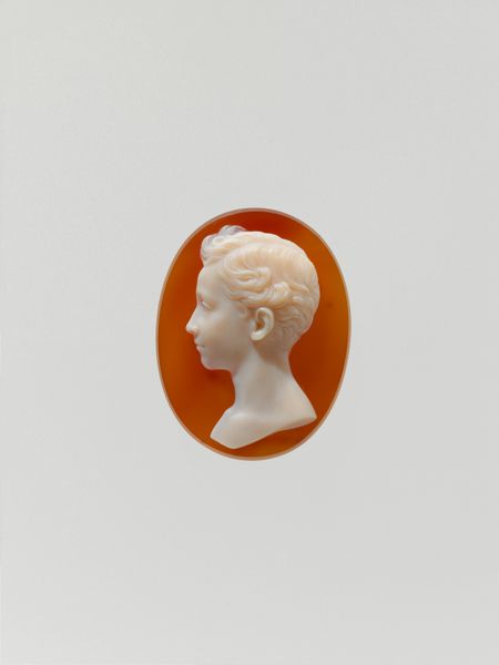
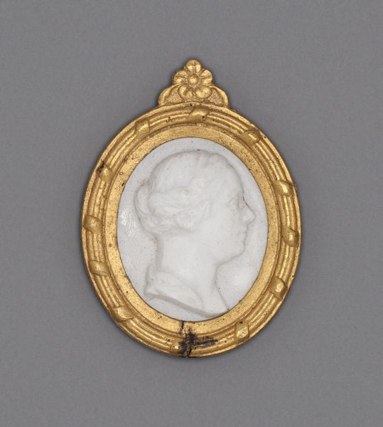
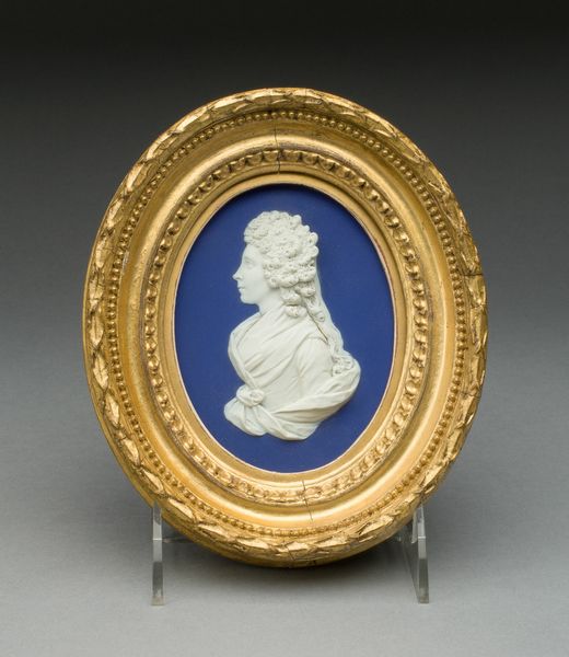
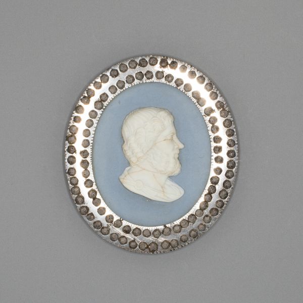
Cameebroche met portret van koningin Emma der Nederlanden c. 1879 - 1890
0:00
0:00
carving
#
portrait
#
carving
#
miniature
Dimensions: height 3.4 cm, width 2.6 cm
Copyright: Rijks Museum: Open Domain
Editor: Here we have a cameo brooch depicting Queen Emma of the Netherlands, created circa 1879-1890 by Firma Verschuur & Van der Voort. The portrait is carved into what appears to be agate, and framed exquisitely. What strikes me most is the contrast between the pale carving and the darker background. What do you notice first, looking at this piece? Curator: The interplay of contrasting materials commands my immediate attention. The artist’s choice of the stratified agate—or possibly chalcedony—enables a clear figure-ground relationship solely through variations in color. The material's inherent layering allows the form of the Queen to emerge. Did you note the arrangement of framing elements further accentuates this relationship? Editor: I did! The dark border against the pale carving really makes the Queen's profile stand out. What else can you tell me about the design choices? Curator: Note the geometric repetition used to frame the oval, broken by only four decorative flourishes. Their placement guides the eye along the perimeter before returning us to the Queen's likeness. How might that affect the interpretation? Editor: It keeps my focus on the queen. And how the diamonds placed within that ornate setting catch light—it feels like a calculated strategy to enhance visual interest without detracting from the central subject. I hadn’t considered the purposeful eye direction that is crafted! Curator: Precisely. It is an object where the materiality serves both aesthetic and representational purposes, creating a harmonious visual experience through structure and detail. We understand this brooch through those elements of visual design. Editor: I see that now. It's incredible how the materials and framing enhance the subject! Thanks for helping me look closer.
Comments
No comments
Be the first to comment and join the conversation on the ultimate creative platform.
More like this