Dimensions: overall: 101.6 × 127 cm (40 × 50 in.) framed: 128.91 × 154.62 × 8.89 cm (50 3/4 × 60 7/8 × 3 1/2 in.)
Copyright: National Gallery of Art: CC0 1.0
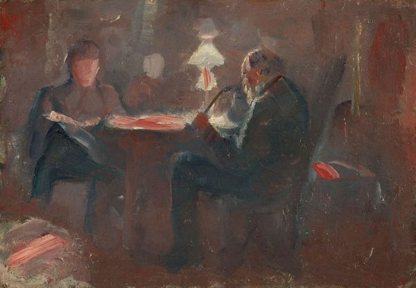
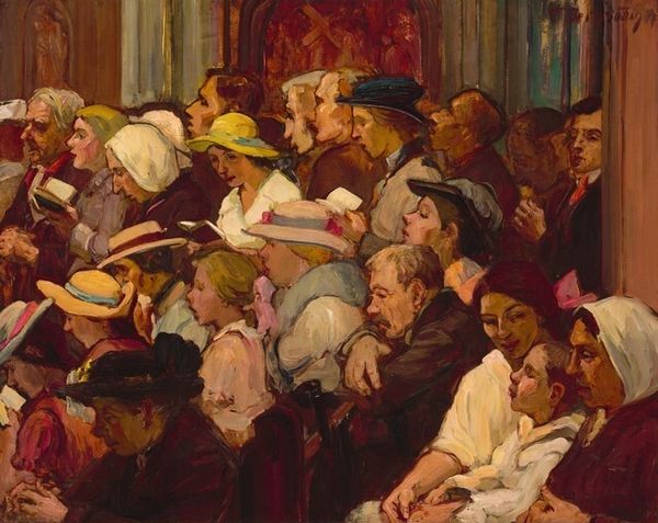
Editor: Here we have Theresa Bernstein’s “The Readers,” an oil painting from 1914. I’m immediately drawn to the warmth created by the colors and light; the composition feels almost claustrophobic, in a comforting way. What formal qualities stand out to you? Curator: Indeed. Observe how Bernstein constructs space. Rather than relying on traditional linear perspective, she uses blocks of color and the repetition of form to create depth. Note the use of impasto. How does this thick application of paint affect your perception of the work’s surface? Editor: It definitely makes the scene feel less distant and more immediate – it gives a vivid sense of the scene in person. It’s like I can feel the texture of the canvas, even without touching it. Curator: Precisely. Consider the restricted palette, predominantly earth tones. Bernstein modulates these colors subtly, using warm reds and oranges in the foreground, balanced with cool grays and blues receding into the background. What impact does that limited range of colors have on the artwork's emotional tenor? Editor: I think it enhances that cozy, contained feeling, like a refuge from the world outside. It draws you in closer to each figure’s private experience of reading. Curator: An astute observation. Furthermore, observe the overall structure; how the artist builds the space. Editor: I appreciate your emphasis on the way she manipulated shape and color to suggest the overall composition; it makes me want to dive into Bernstein’s work more deeply. Curator: The picture plane is the arena wherein form contends with space, resulting in that marvelous painting that gives enduring satisfaction.
Comments
No comments
Be the first to comment and join the conversation on the ultimate creative platform.
More like this