![Vermaak, o jeugd! uw oog en geest, / Als gij deez' prenten ziet en leest [(...)] by Philippus Jacobus Brepols](/_next/image?url=https%3A%2F%2Fd2w8kbdekdi1gv.cloudfront.net%2FeyJidWNrZXQiOiAiYXJ0ZXJhLWltYWdlcy1idWNrZXQiLCAia2V5IjogImFydHdvcmtzLzQzNWZhZmZjLWYxMmUtNGI0Ni04NmFlLTRlMjRhNzFkOGU4OS80MzVmYWZmYy1mMTJlLTRiNDYtODZhZS00ZTI0YTcxZDhlODlfZnVsbC5qcGciLCAiZWRpdHMiOiB7InJlc2l6ZSI6IHsid2lkdGgiOiAxOTIwLCAiaGVpZ2h0IjogMTkyMCwgImZpdCI6ICJpbnNpZGUifX19&w=3840&q=75)
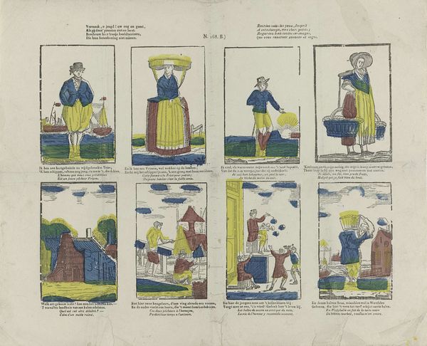
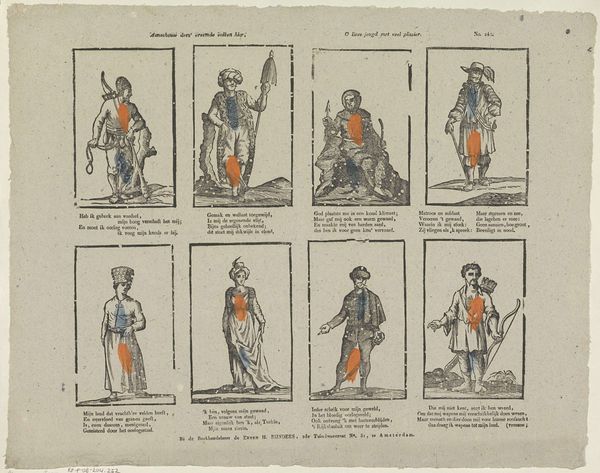
Vermaak, o jeugd! uw oog en geest, / Als gij deez' prenten ziet en leest [(...)] 1800 - 1833
0:00
0:00
philippusjacobusbrepols
Rijksmuseum
graphic-art, print, etching
#
graphic-art
#
narrative-art
#
dutch-golden-age
# print
#
etching
#
genre-painting
#
regionalism
Dimensions: height 327 mm, width 389 mm
Copyright: Rijks Museum: Open Domain
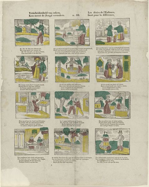
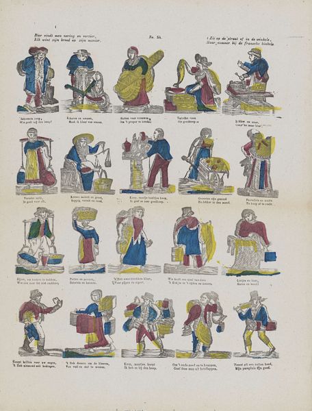
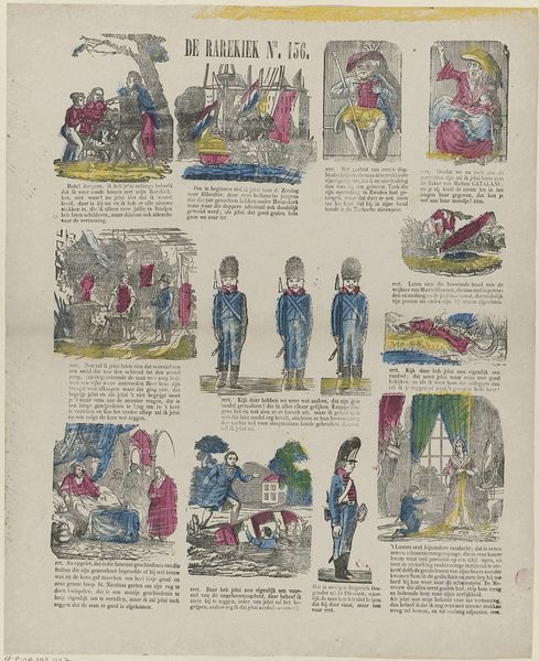
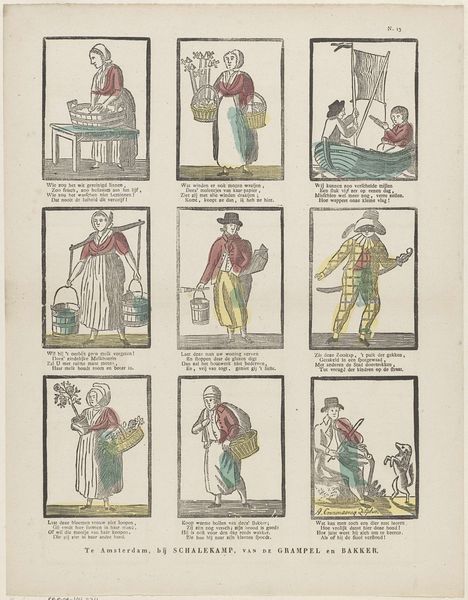
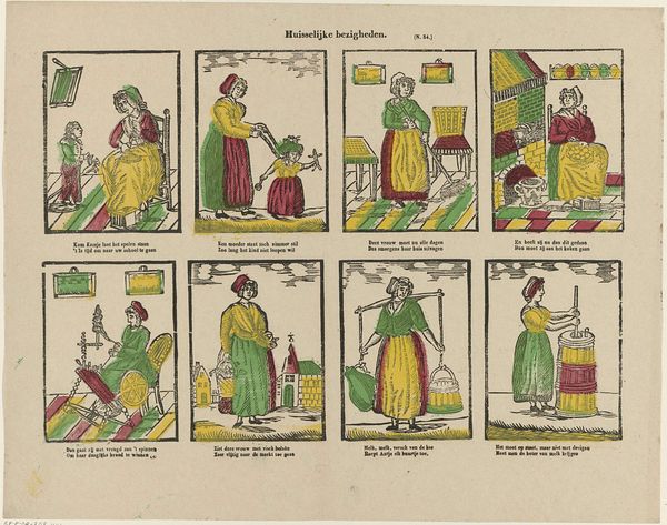
Curator: Here we have a rather charming etching and print by Philippus Jacobus Brepols, created sometime between 1800 and 1833. The title translates roughly to "Amusement, O Youth! Your Eye and Mind." It's currently held in the Rijksmuseum. Editor: My immediate reaction is to the layout. Eight separate scenes, almost like a storyboard or early comic strip, all on one sheet. And that faint hand-coloring. It speaks of a modest production. Curator: Indeed, and each little scene tells a story, often about youthful folly or lessons to be learned. See the figure in the upper left with his hands tucked into his waistband? A warning against idleness perhaps. The symbols speak volumes: boats hinting at voyages, houses hinting at home and future stability, food pointing to the consequences of industry. Editor: The materials and process are crucial to understanding its reach. An etching printed onto paper meant a wider audience than, say, an oil painting for the wealthy. Each image reflects labor: consider the people selling wares and moving stock, a clear reference to contemporary economy, right? Curator: Precisely. This wasn't about glorifying aristocracy; it was about reflecting everyday life and imparting moral lessons to the burgeoning middle class through the appeal of genre painting. Editor: And each small hand-tinted etching likely different, no exact duplication but small variation based on individual human hands. An interesting blend of mass production and human touch. Curator: Note also how certain clothing choices reflect regional Dutch traditions: the bonnets, puffed pants, shawls… These would have held specific meanings for those familiar with different towns. The whole artwork functions as both a celebration and gentle critique of local culture. Editor: Exactly, the deliberate choice of subject and method suggests accessibility. Printed for education and a new kind of visual language intended to disseminate messages. Curator: And look at the text beneath each image; a short rhyming couplet to underscore the moral. Brepols has really layered meaning onto meaning here, hoping for clarity. Editor: So much implied activity—so much implied consumption. And we are still consuming it today. Interesting. Curator: Seeing these archetypes within the print allows me to reflect on what persists through generations and the enduring concerns of society. Editor: And examining how it was made illuminates the societal dynamics that give form to art's message and ensures its preservation.
Comments
No comments
Be the first to comment and join the conversation on the ultimate creative platform.
More like this