mixed-media
#
mixed-media
#
pop art
#
geometric
#
pop-art
#
line
Copyright: Jim Dine,Fair Use
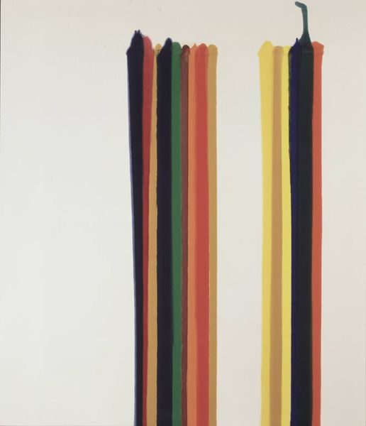
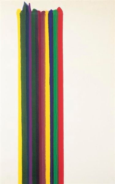
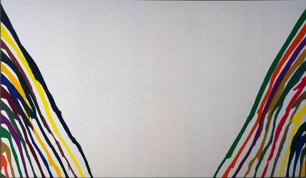
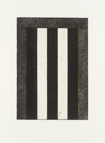
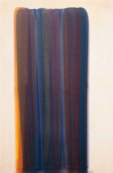
Curator: Ah, "Tool Box 10" by Jim Dine, created in 1966 using mixed media. It’s quite striking, isn’t it? Editor: It is. My initial impression is a feeling of organized chaos. The grayscale imagery at the top… it feels heavy, almost industrial, contrasting sharply with the playful cascade of colorful stripes beneath. It's…oddly joyful in a fragmented way. Curator: Exactly! The juxtaposition is crucial. We see a screen-printed or perhaps lithographed image, meticulously rendered in grayscale—a stark representation of utilitarian objects. Then, these vibrantly colored lines, disrupting the rigid order of the upper register. Editor: They really do "pop," don’t they? Pun intended, I suppose, considering Dine's involvement in the Pop Art movement. I wonder, are those colours representative of anything specific within the toolbox? Are they clues? Or more abstract expressions? Curator: That's a tantalizing question! Dine often imbued his works with personal symbolism. While not explicitly defined, the vibrant colours can be viewed as emotional signifiers or, in line with Pop Art, direct references to consumerism and mass production. The tension between the mechanical and the emotional, the functional and the aesthetic... Editor: You know, it also feels very "now" – very contemporary despite its age. The superimposition feels very modern. It sort of feels like a prototype; a design, deconstructed. Curator: Indeed. His works from this period showcase a consistent engagement with objecthood and representation, challenging conventional boundaries through bold colour choices and diverse materiality. Consider how Dine treats the picture plane, segmenting it visually. The interplay evokes semiotic disruption... Editor: So, breaking the language of imagery. Revealing layers of representation? The toolbox, already a symbol of creation and repair, becomes fodder for artistic… what, deconstruction? Exploration? I can imagine Jim Dine almost mischievously deciding on what to print above the stripes… what is being built, designed, and created? The tension gets to me… It creates an open, almost vulnerable ending for my experience. Curator: An excellent summary. The work functions on multiple levels. Its enduring power comes from its resistance to simple classification; it’s neither pure representation nor absolute abstraction, existing instead in a fascinating liminal state. Editor: A very intriguing piece indeed! It's stayed with me, I must admit!
Comments
No comments
Be the first to comment and join the conversation on the ultimate creative platform.
More like this