drawing, textile, paper, ink, pencil, frottage
#
drawing
#
textile
#
paper
#
ink
#
pencil
#
frottage
Copyright: Rijks Museum: Open Domain
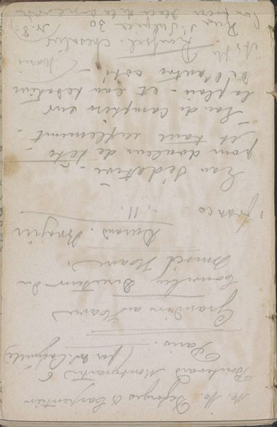
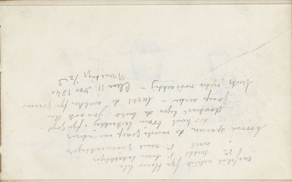
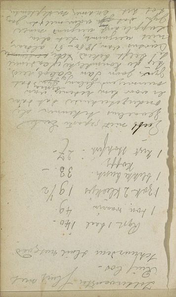
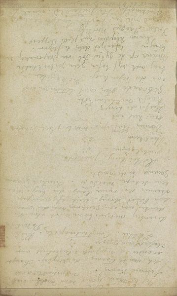
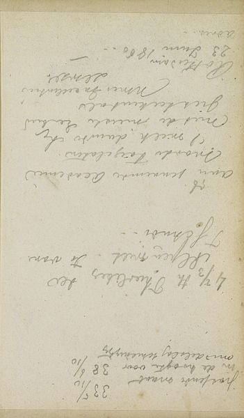
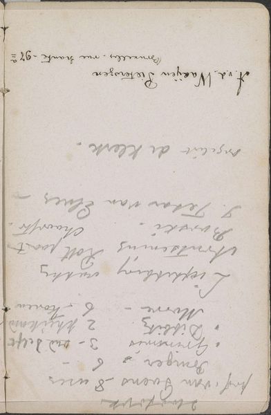
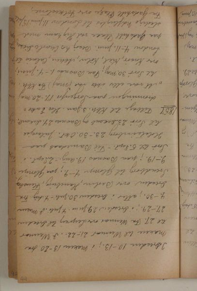
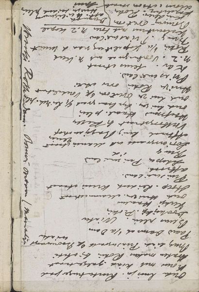
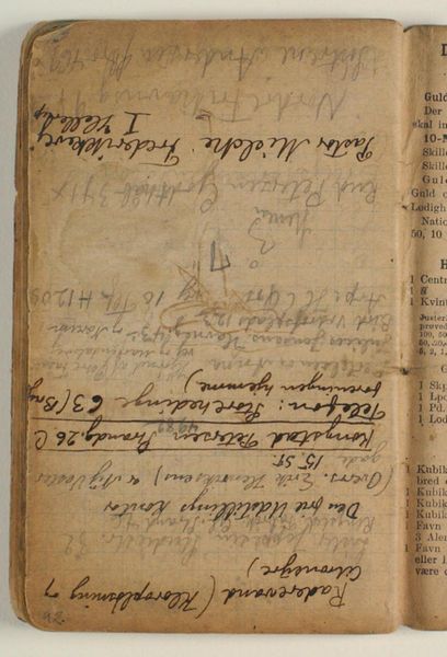
Editor: Here we have "Wetsartikel" created between 1862 and 1864 by Johannes Tavenraat, housed at the Rijksmuseum. It seems to be a mixed media piece incorporating drawing, textile, paper, ink, pencil, and even frottage. The layering of text and varied mark-making gives it an almost palimpsestic quality, like a page heavily worked and reworked. How do you interpret this work? Curator: From a formalist perspective, what arrests my attention is the interplay of textures and planes. Note how Tavenraat employs differing pressures in his pencil and ink work, creating areas of high contrast and subtle tonal shifts. How do the lines, both the ruled ones that define the "page" within the page, and the freely drawn and calligraphic ones that convey script, interact? Editor: I see what you mean. The structure creates a sense of depth. What’s the effect of incorporating the textile element? Curator: Indeed. The textile seems integral, providing a tactile contrast to the smoothness of the paper. Consider how the weave's inherent geometry juxtaposes against the free-flowing script. Also consider how he incorporates a variety of media to enhance the visual texture. It's almost as though the materiality itself becomes part of the 'meaning,' wouldn't you say? Editor: That’s an interesting point. It makes me look at the composition with a greater appreciation for the textural contrasts. Curator: Precisely. What was initially, from the perspective of art history, simply an archival document, has through a closer reading, through a more concentrated assessment of its line, shape, color and composition, becomes, formally at least, quite rich, wouldn't you agree? Editor: Absolutely. It highlights the importance of close visual analysis and an awareness of how different media interact.
Comments
No comments
Be the first to comment and join the conversation on the ultimate creative platform.
More like this