#
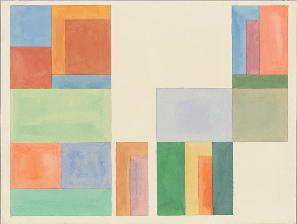
abstract painting
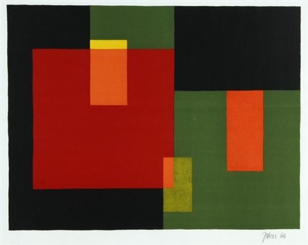
# print
#
constructivism
#
geometric
Dimensions: height 680 mm, width 420 mm
Copyright: Rijks Museum: Open Domain
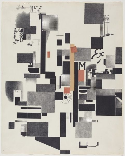
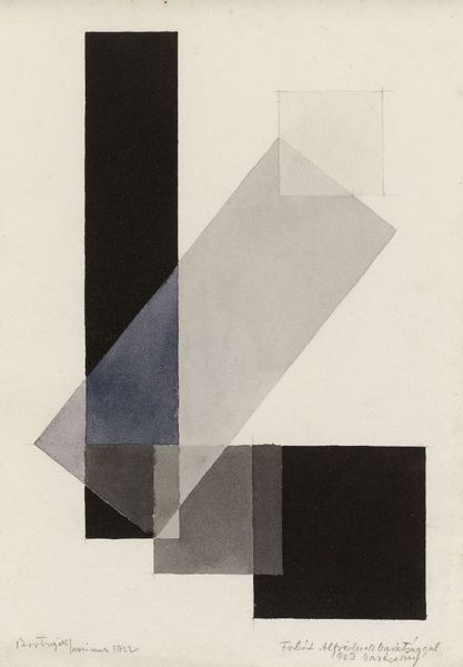
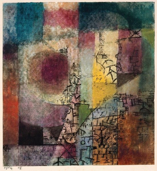
Curator: Hendrik Nicolaas Werkman created this print, simply titled "Composition," in 1924. It exemplifies the principles of Constructivism. Editor: It has a wonderfully layered, almost ghostly quality. The muted colours—the greens, reds, yellows—combined with the stark geometric forms…it feels very deliberate in its visual impact. Curator: Werkman was heavily involved with the avant-garde art scene in the Netherlands, which during the interwar years saw a blossoming of constructivist ideas about art's role in societal transformation. His art really demonstrates how new printing techniques could make modernism accessible to wider audiences. Editor: Definitely, the layering gives such depth, which plays interestingly with the flat, block-like forms. Tell me, does the repetition of rectangles symbolize a cityscape? There’s definitely something architectural to the way these forms stack. Curator: Possibly, but I am more fascinated by how his printing method interacts with this potential reference. He would create multiple prints from various hand-cut stencils and then overlay them. In a sense, he democratized printmaking. He rejected the polished, perfectionist techniques used by earlier generations in favour of a more raw and spontaneous application. Editor: It has a fantastic sense of texture, though it's actually fairly restrained. It would be interesting to know the extent to which he embraced 'chance' when making the layers. The result, while systematic, maintains some accidental, expressive feel. Curator: Yes, while Constructivism aimed for universality through simplified form, the cultural and socio-political reality for Werkman involved adapting these aesthetics through very individualized artistic expression. It really represents his efforts to communicate universal ideals within a more vernacular framework. Editor: What an eloquent example of this tension between utopian ideals and material constraint! Curator: Absolutely. The composition isn't just a series of blocks but also a reflection of this artist's historical experience in a very tumultuous period in European history.
Comments
rijksmuseum over 2 years ago
⋮
This abstract composition is one of the earliest prints by the Groningen printer Hendrik Werkman. For his druksels (‘printsels’), as he called them, he used typesetting material from his workshop and cut-out templates. By stamping these in different colours and combinations, he created works with a highly personal and unique character. During the Second World War, Werkman used his printed matter as a form of spiritual resistance against the occupying forces, paying for it with his life.
Join the conversation
Join millions of artists and users on Artera today and experience the ultimate creative platform.
More like this