drawing, paper, ink, pen
#
drawing
#
dutch-golden-age
#
ink paper printed
#
paper
#
personal sketchbook
#
ink
#
ink drawing experimentation
#
pen-ink sketch
#
sketchbook drawing
#
pen
Copyright: Rijks Museum: Open Domain
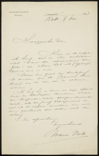
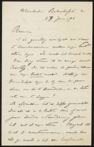
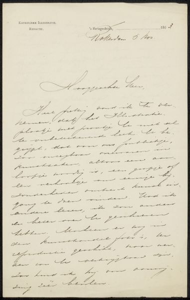
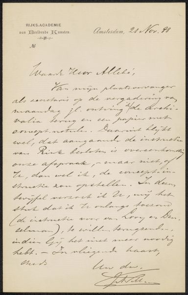
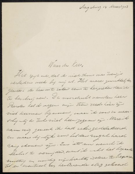
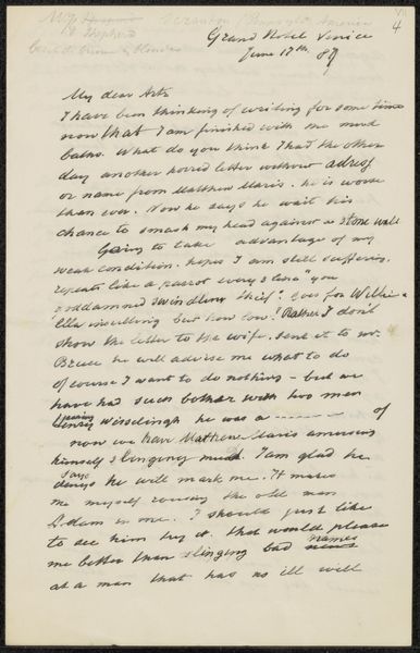
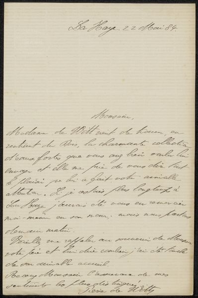
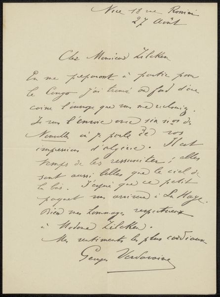
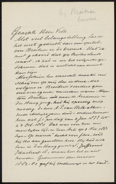
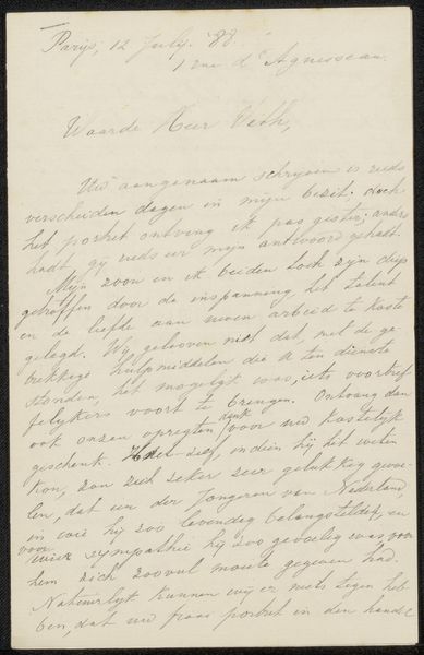
Curator: Welcome. Here we have “Brief aan Philip Zilcken” possibly created around 1897 by Willem Byvanck, an ink drawing on paper. The composition strikes me as surprisingly intimate. Editor: There's a delicacy to the handwritten script against the aged paper, a glimpse into another era of communication. But isn't there also a palpable sense of hierarchy inherent in the act of writing letters, who is privileged enough to have the time and means, and who is addressed? Curator: Indeed. The elegance of the cursive is a visual marker of its historical context. Note the balance struck between open space and densely packed text, leading the eye in a deliberate rhythm across the page, the confident loops and delicate strokes of each letter form, it has an intrinsic artistic merit as design. Editor: I'm drawn to considering the implicit power dynamic. Letters such as this reflect the literary culture of the time, mostly confined to elite social groups and serving as important documentation of literary circles. Was there some kind of editorial oversight over them at the time and who was kept out? Curator: Possibly, though more important is how the artist has masterfully used negative space. Look at the deliberate placement of the address, how it counterbalances the signature, framing the emotional core of the letter. It suggests formal structure with an understated sophistication. Editor: We should not shy away from the ways in which art can legitimize and solidify privilege. Personal archives contain much historically significant writing that can only come about because of exploitation. While appreciating form, should we also explore why that specific form existed? Curator: Perhaps that could mean missing how Byvanck has demonstrated such impressive skill, which the choice of medium supports in its starkness. The deliberate restraint allows each carefully formed word to gain presence. Editor: By juxtaposing form and history, we not only enrich the experience, but also recognize how privilege and power affect everything, even seemingly gentle correspondence such as this letter. It is this intersection of what we see and what it truly stands for that ultimately interests me most. Curator: A rewarding synthesis! I can now recognize its artistic value and it also leaves the mind abuzz contemplating how that beauty relates to broader political issues. Editor: Agreed. Nuance, after all, arises from careful contemplation!
Comments
No comments
Be the first to comment and join the conversation on the ultimate creative platform.
More like this