drawing, watercolor
#
drawing
#
watercolor
#
line
#
history-painting
#
watercolor
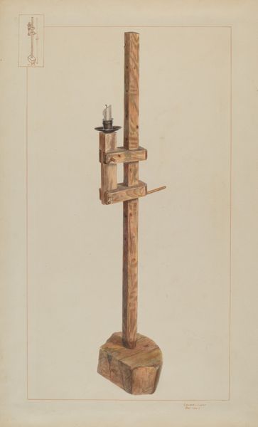
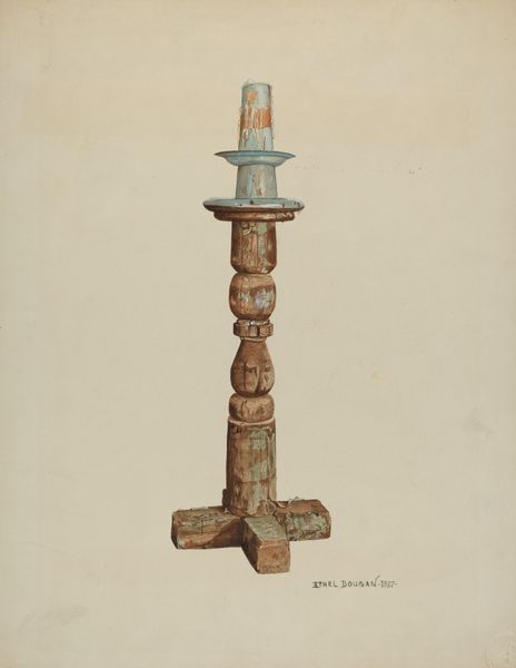
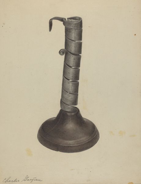
Dimensions: overall: 36.5 x 27 cm (14 3/8 x 10 5/8 in.) Original IAD Object: 78" high
Copyright: National Gallery of Art: CC0 1.0
Curator: Editor: This is Majel G. Claflin’s “Holy Water Font,” made with watercolor and drawing between 1935 and 1942. It strikes me as very symmetrical and the line work, though simple, has a precision that is fascinating. What compositional elements stand out to you? Curator: Immediately, the interplay of geometric forms commands attention: the cylindrical shaft ascending from the tiered, almost pyramidal base. Observe how Claflin meticulously renders the subtle gradations of tone and hue to define each layer of the base, contrasting sharply with the comparatively smooth surface of the stem. How does the line quality enhance your appreciation? Editor: Well, the line work, especially around the top element, gives a sense of intricate detail, almost architectural in nature. It feels carefully planned, not spontaneous. Curator: Precisely. The artist’s attention to linear detail serves not only to delineate forms but also to create a sense of depth and volume. Consider, too, the economy of line in the depiction of light and shadow. Ask yourself, what relationship is being drawn, literally and figuratively, between form and function? Editor: It’s interesting how the different textures—the rough base, the smooth shaft, and then the more ornate top—create a visual hierarchy. I hadn't initially considered that. Thanks for highlighting the interplay of form and light. Curator: Indeed. Close attention to the intrinsic formal qualities often yields unexpected perspectives and interpretations. Hopefully this approach expands your aesthetic toolbox!
Comments
No comments
Be the first to comment and join the conversation on the ultimate creative platform.
More like this