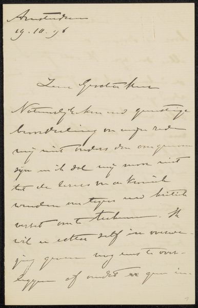
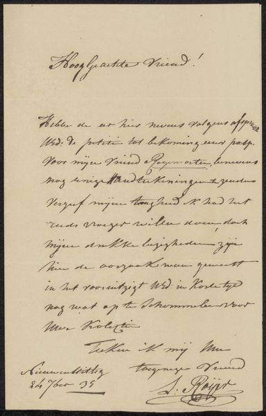
drawing, paper, ink
#
drawing
#
ink paper printed
#
hand drawn type
#
paper
#
ink
#
hand-drawn typeface
#
ink drawing experimentation
#
romanticism
#
calligraphic
#
calligraphy
Copyright: Rijks Museum: Open Domain
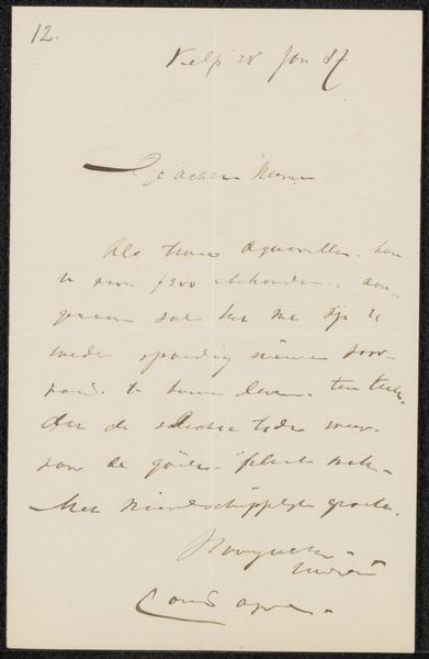
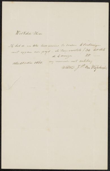
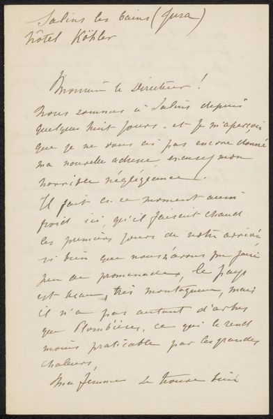
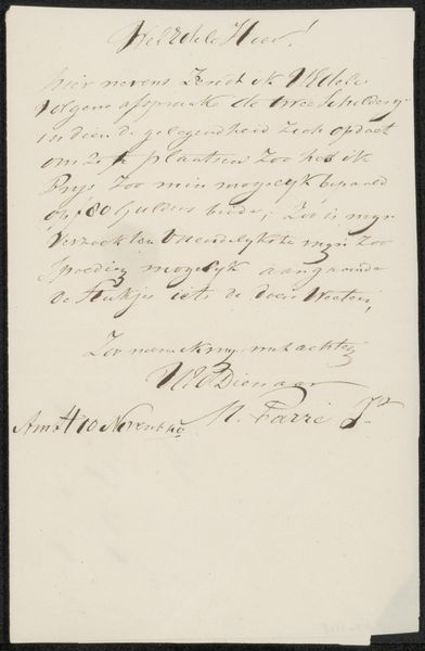
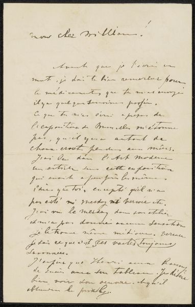
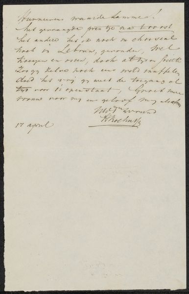
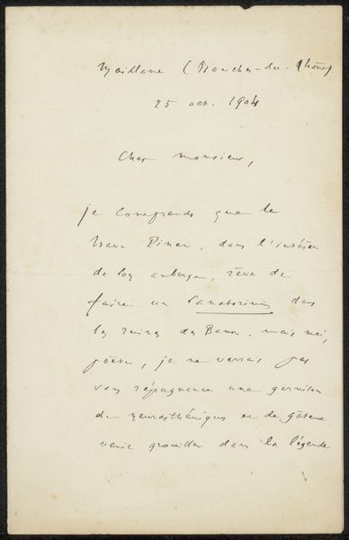
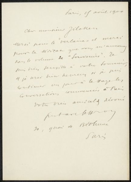
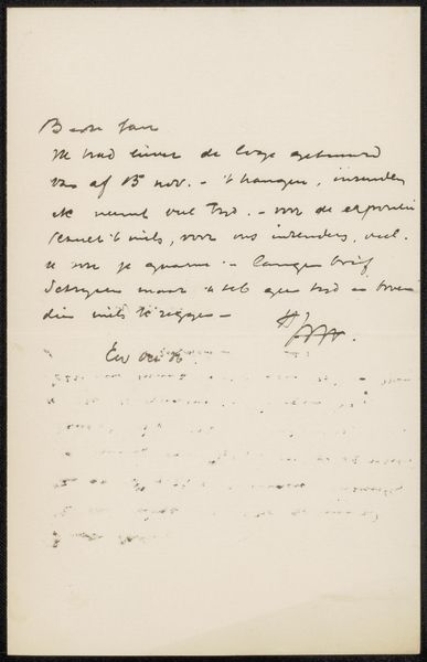
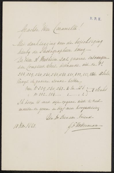
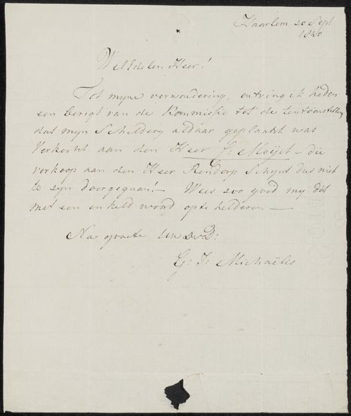
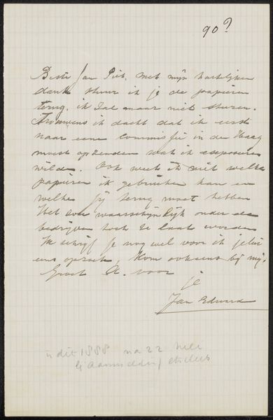
Editor: This is “Brief aan Ary Johannes Lamme,” an ink drawing on paper by Gioacchino Antonio Rossini, likely dating from somewhere between 1824 and 1868. It's really just a letter, and yet the calligraphic style elevates it. I’m struck by how the formal script interacts with the plain paper. What do you see in it? Curator: The aesthetic interest lies primarily in the interplay of line, texture, and form created by the ink on paper. Consider the weight of the strokes – observe the modulation from thin, delicate hairlines to bolder, more emphatic marks. It showcases mastery over the calligraphic art, transforming a simple message into a sophisticated study in visual balance and rhythm. Notice how the formal structure is disrupted by irregularities in ink density? Editor: That's true, it almost makes it look…alive. But it’s just handwriting, isn’t it? How do you see beyond the basic function? Curator: Its functionality, its purpose in communication, is secondary. Focus instead on the artist’s intentional choices – the spacing of words, the flourishes added for purely decorative effect. These elements work together to create a unique composition independent of the letter's literal meaning. Editor: So it's less about what the letter says, and more about how it looks doing it? That's a good way to look at it! I see how appreciating those small details really changes my view. Curator: Exactly. And by focusing on the formal elements, we reveal the intrinsic value of a piece like this, where the medium and technique become the message themselves.
Comments
No comments
Be the first to comment and join the conversation on the ultimate creative platform.
More like this