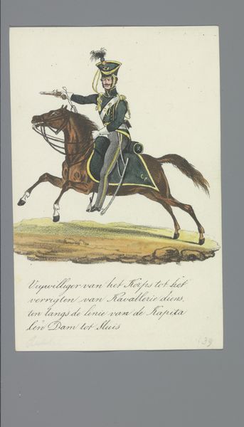
drawing, poster
#
portrait
#
drawing
#
caricature
#
caricature
#
figuration
#
cartoon
#
history-painting
#
academic-art
#
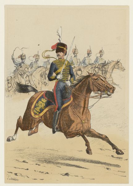
poster
Copyright: Public Domain: Artvee
Editor: We're looking at "Collier's Feb 22 1908," a poster by Edward Penfield. I'm struck by the sharp lines and how flat the colours are. The horse seems a bit stiff, but overall, there's a captivating balance. How do you interpret this work, focusing on its formal qualities? Curator: Let's consider Penfield's use of line and form. Observe the clear separation between color fields. Notice how the simplified shapes, while descriptive, avoid any illusion of depth. Do you perceive a conscious attempt to flatten the pictorial space? Editor: Absolutely. The limited palette further reinforces this flatness. The horse and rider, while representational, are simplified into blocks of color outlined in bold strokes. The background appears more decorative than spatial. Curator: Precisely. The background, with its vertical striations, acts more as a textural element than a receding plane. This deliberate emphasis on surface design is key. The composition draws the eye around the picture plane, ensuring no single element dominates. What does this kind of compositional structure evoke? Editor: A sense of dynamism, maybe? Despite the flatness, there's a real energy in how the elements are arranged. And the limited palette is really working, drawing my eyes into the contrast between the horse and rider, and then onto the title, "Collier's". Curator: Yes, the strategic arrangement creates a dynamic interplay. By denying deep space and employing clear outlines, Penfield achieves a sophisticated visual tension, emphasizing the artwork's objecthood and its graphic function as a poster. It also directs your gaze into a particular path. I would say this gives the artist a sense of mastery, in creating this directionality through this design choice. Editor: I hadn’t considered that. Focusing on the lines and colours really changes my initial perspective. Now it does feel very directional, leading the eyes! Curator: Indeed. By closely examining its formal structure, we can understand the artwork beyond just its subject matter, allowing a richer and more nuanced appreciation of Penfield's skill.
Comments
No comments
Be the first to comment and join the conversation on the ultimate creative platform.
More like this