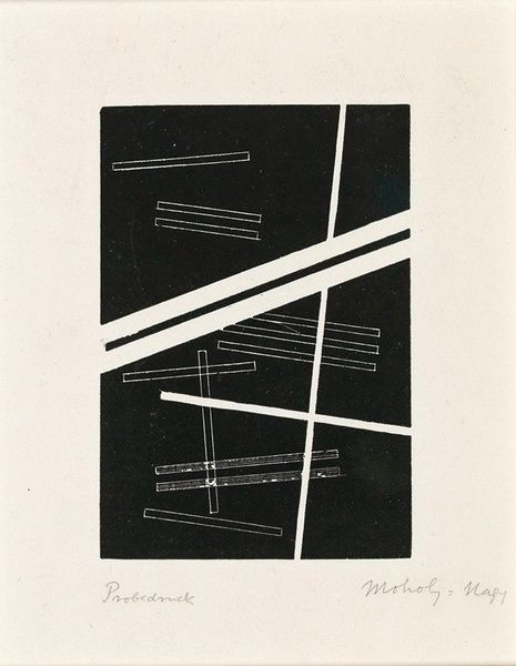
graphic-art, mixed-media, print, typography, ink
#
graphic-art
#
mixed-media
# print
#
typography
#
pop art
#
painted
#
abstract
#
text
#
typography
#
ink
#
geometric
#
line
#
experimental typography
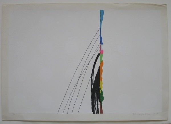
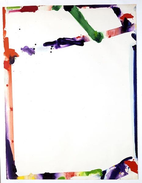
Copyright: Funasaka Yoshisuke,Fair Use
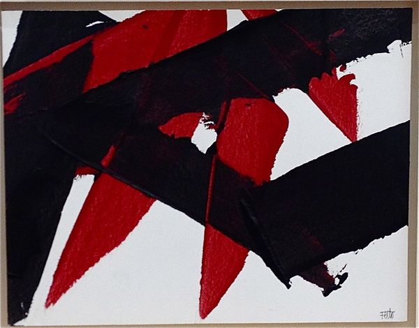
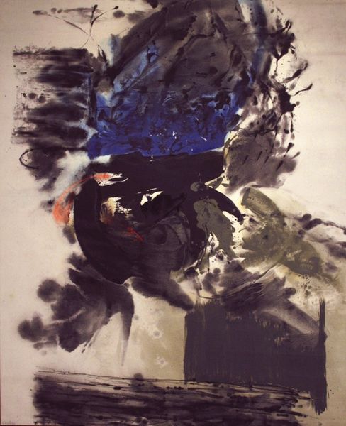
Funasaka Yoshisuke made "646" as a print, and it’s got this cool mix of bold and subtle stuff happening. It’s like he's juggling different ways of making marks, some loose and splattery, others super controlled. I find myself drawn to the big, black brushstroke that dominates the left side. It’s messy, kind of wild, with all these little ink droplets flying off. But then, right next to it, you have these thin, colored lines that are so precise, almost like they’re floating. The texture of the black ink looks like it has a bit of a sheen, doesn't it? It makes me wonder about the kind of paper he used and how it soaked up the ink. The contrast between the raw energy of the brushstroke and the clean lines makes the whole thing pop. You could say Yoshisuke is doing his own version of what Robert Motherwell was exploring, the spontaneity of the gesture, but with a Japanese twist. It's like a little poem with no one true meaning.
Comments
No comments
Be the first to comment and join the conversation on the ultimate creative platform.
More like this