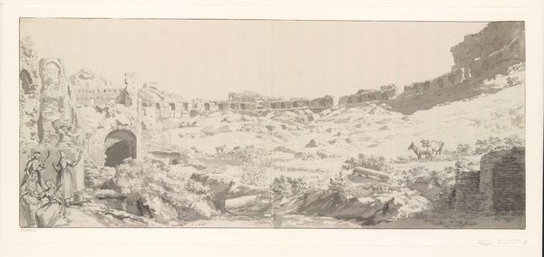
drawing, tempera, paper, ink
#
drawing
#
water colours
#
baroque
#
tempera
#
landscape
#
paper
#
ink
#
classicism
#
history-painting
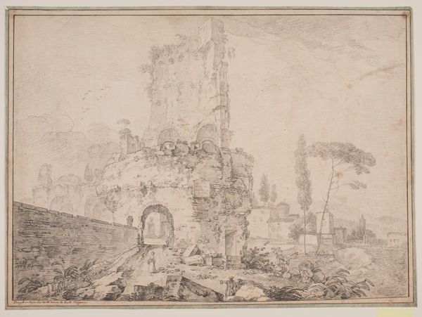
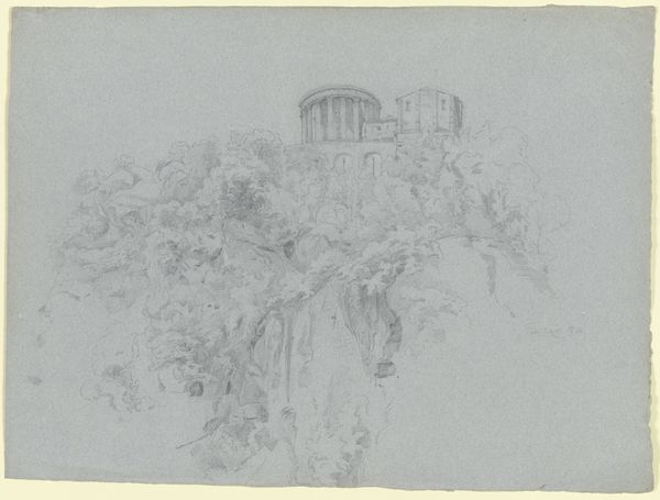
Dimensions: height 251 mm, width 397 mm
Copyright: Rijks Museum: Open Domain
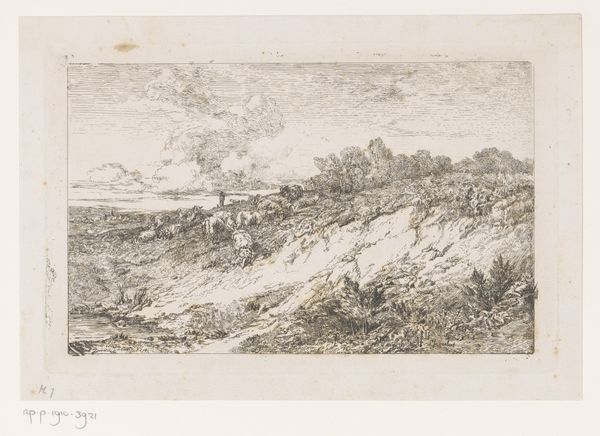
Editor: So, here we have Cornelis van Poelenburch’s “The Temple of the Sibyl at Tivoli," created sometime between 1620 and 1623 using ink, tempera, and watercolors on paper. I find it really evocative with that limited palette. What stands out to you in this drawing? Curator: Initially, the interplay of light and shadow seizes my attention. Observe how Poelenburch orchestrates the tonal variations. The skillful deployment of chiaroscuro lends depth and volume to the architectural form of the temple. What effect do you believe is achieved by using a limited range of monochromatic tones? Editor: I suppose it simplifies the form. The details don't distract as much. I wonder how it compares to other artists renderings of the same scene, if that was a common subject. Curator: Precisely. Poelenburch reduces the complexity to expose the fundamental structure. Also, it calls attention to the textures he creates using the various materials like ink and watercolours. Consider the contrast between the smooth surfaces of the temple columns and the rough texture of the surrounding landscape. Does this textural differentiation inform our understanding of the architectural object? Editor: Absolutely, it sets up a pleasing formal contrast. The crisp lines of the temple are highlighted by the looseness around them. I now see the architectural rendering as more ideal and eternal in that light. Curator: Indeed, and furthermore, contemplate the implied geometry within the composition. What is the underlying structure supporting the image's overall sense of stability? Editor: I think that’s a great place to continue reflecting. Thank you! Curator: My pleasure!
Comments
No comments
Be the first to comment and join the conversation on the ultimate creative platform.
More like this