ink
#
script typography
#
hand-lettering
#
hand drawn type
#
hand lettering
#
ink
#
hand-drawn typeface
#
pen work
#
handwritten font
#
calligraphy
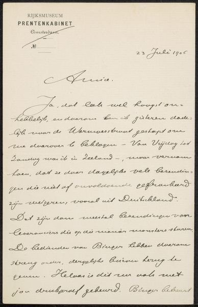
Copyright: Rijks Museum: Open Domain
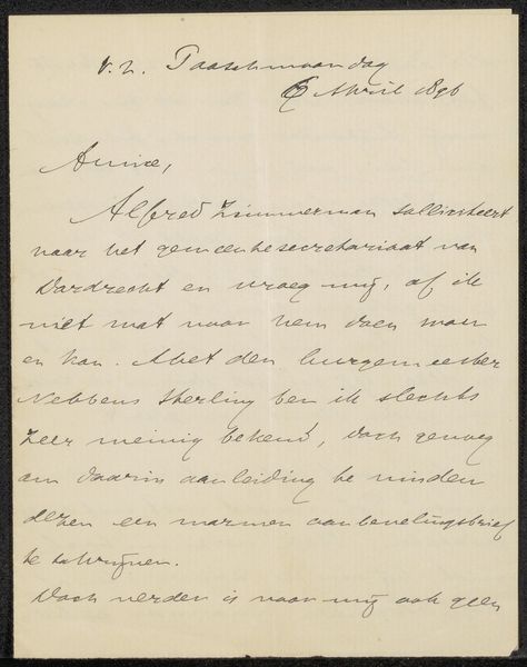
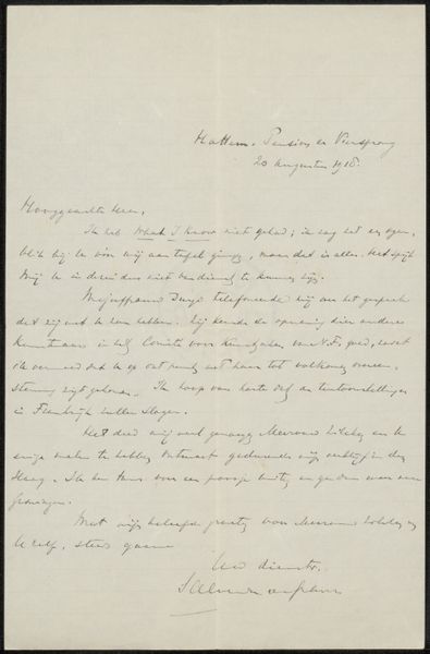
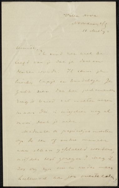
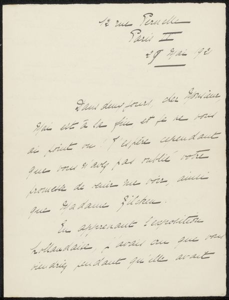
Editor: Here we have “Brief aan Jan Veth,” a letter possibly from between 1911 and 1924 by André Jolles. It’s written with ink, and I’m struck by the intimacy of the piece, the way the handwritten script creates a direct connection to the author. What do you see when you look at this work? Curator: Focusing on the visual components, the linear quality of the ink on the page establishes a fascinating rhythm. The varying pressure of the pen creates subtle shifts in tone and weight, structuring the text. Observe the interplay between the ascending and descending strokes, which lend a unique dynamic to the overall design. The handwriting functions almost like an abstract composition, with each word contributing to a complex pattern on the page. Have you noticed how the formal elements influence the viewer's perception, beyond just legibility? Editor: I hadn't considered the varying pressure before. I was so focused on trying to decipher the handwriting itself. It's interesting how the shapes of the letters create an almost textural quality. Is that something you think Jolles would have been conscious of? Curator: It is certainly plausible, though it might be unintentional. Regardless, by analyzing its material execution and intrinsic structural features, such as contrast, spacing, and flow, we understand that a formal assessment grants access to facets which, if disregarded, remain imperceptible. A focus on its material elements enhances comprehension. Editor: I see your point. Focusing on those qualities allows a new interpretation. Thanks for sharing your perspective! Curator: It was my pleasure. Every observation builds understanding and new connections!
Comments
No comments
Be the first to comment and join the conversation on the ultimate creative platform.
More like this