drawing, paper, ink
#
drawing
#
baroque
#
landscape
#
paper
#
ink
#
realism
Dimensions: height 124 mm, width 190 mm
Copyright: Rijks Museum: Open Domain
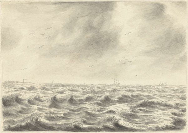
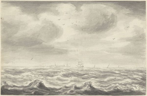
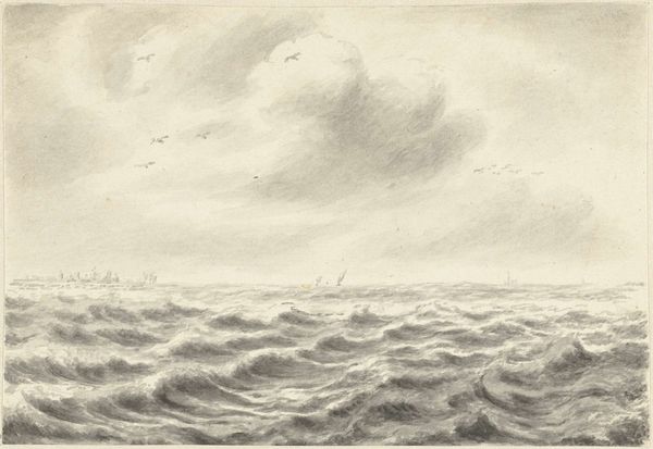
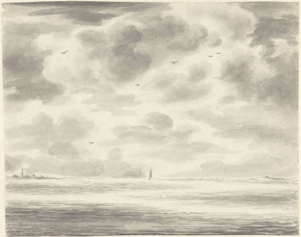
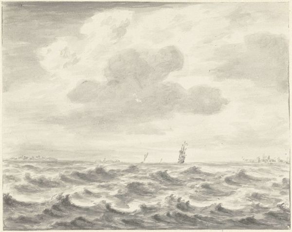
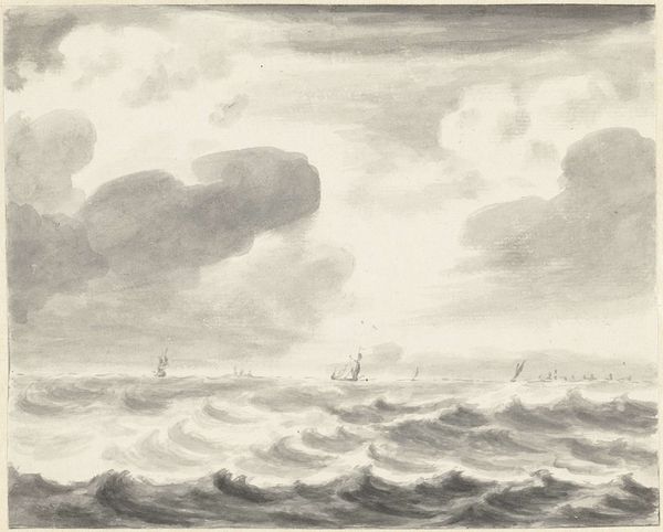
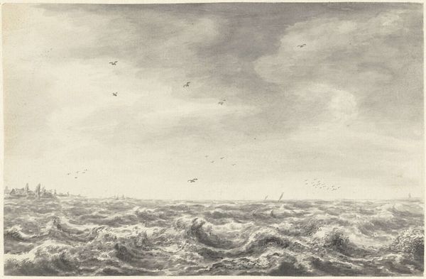
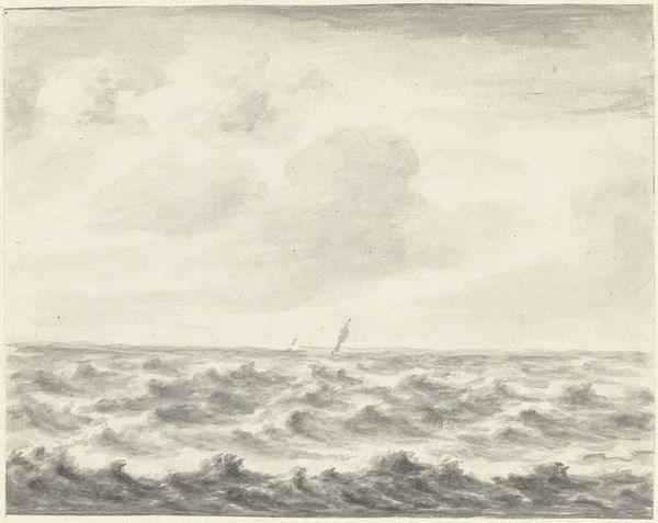
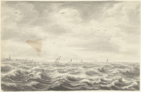
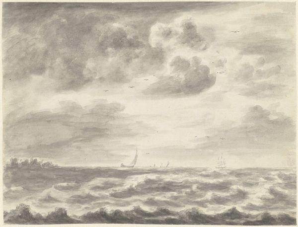
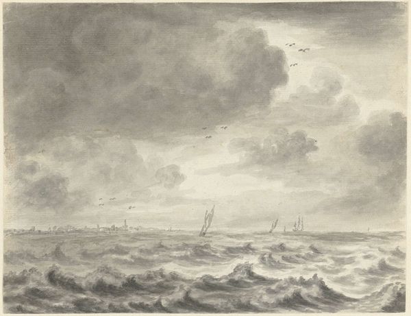
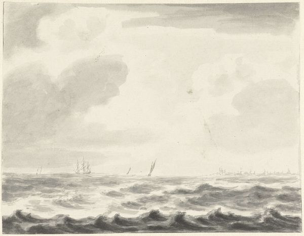
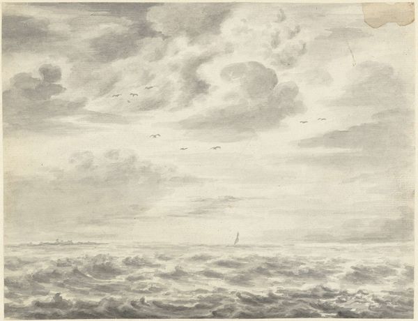
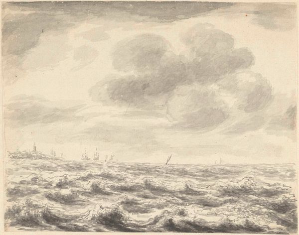
Pieter Idserts created this seascape with pen in gray ink and brush in gray wash. It is deceptively simple. Idserts applied a monochrome palette and diluted the pigment to make it appear thin, and he created a smooth liquid consistency. The effect of the wash is what’s really crucial here. The monochromatic colour scheme and paper’s texture create an evocative rendering of light and atmosphere. Notice how the artist layered different concentrations of diluted ink to create the illusion of depth and movement in the sea and sky. Look at the clouds, full of depth, almost heavy with water. The drawing evokes the maritime culture of the Netherlands, and the economic importance of seafaring trade. This little drawing reminds us that even a simple medium like ink can be a powerful tool for capturing the world around us. By looking closely at materials and processes, we can gain a deeper appreciation for the skill and artistry involved in its making.
Comments
No comments
Be the first to comment and join the conversation on the ultimate creative platform.
More like this