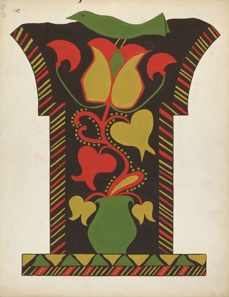
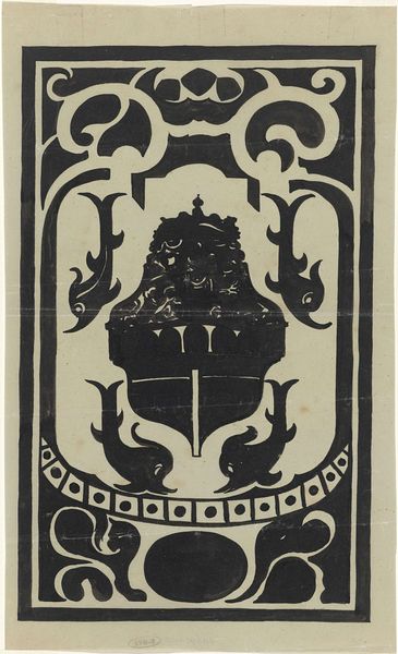
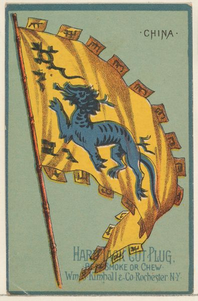
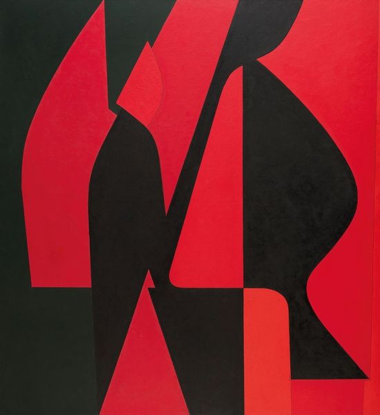
Italiaansche kunst in Nederlandsch bezit. 1 juli-1 oct. 1934. Stedelijk Museum 1934
0:00
0:00
graphic-art, print, typography, poster
#
art-deco
#
graphic-art
# print
#
woodcut effect
#
caricature
#
typography
#
geometric
#
abstraction
#
line
#
poster
Dimensions: height mm, width mm
Copyright: Rijks Museum: Open Domain
Curator: This print, created in 1934 by Huib Luns, is a poster advertising the exhibition “Italian Art in Dutch Possession” at the Stedelijk Museum in Amsterdam. The stark geometry immediately catches the eye. Editor: Absolutely. My first impression is power. The striking black and gold heraldic beast dominates the composition, almost radiating authority. It’s…imposing. Curator: Yes, the design clearly borrows from Art Deco principles, simplifying forms into geometric shapes and relying on bold typography to communicate its message effectively. The use of the griffin as a symbol also warrants attention, because historically they are tied to power and protection. Editor: A rather fraught choice, perhaps, given the period. The early 1930s were seeing rising nationalism and, indeed, fascism in Europe. Exhibiting "Italian Art" under such an emblem invites questions about cultural power and appropriation, doesn’t it? The griffin feels less about 'protection' and more like a claim. Curator: That's an astute observation. Certainly, museums in that era were not neutral spaces, and exhibitions were very much tools for constructing national and cultural narratives. Highlighting Italian art in the Netherlands could have been a deliberate effort to align culturally with Italy. Editor: Precisely. And the fact that it's “in Dutch Possession” further emphasizes this power dynamic. Who gets to own culture, and what does that ownership imply? I find it a difficult juxtaposition, the celebration of art and its complicated relationship with cultural appropriation during a period of political instability. Curator: It makes you think about the function of such events and objects beyond their aesthetic value. Posters, often overlooked as mere advertising, were actually active participants in constructing identity and justifying power structures. Editor: Absolutely. Even the geometric abstraction, rather than feeling purely stylistic, reinforces a sense of order and control – reflecting broader societal anxieties and ideological ambitions. It speaks volumes, even without explicitly stating its purpose. Curator: Indeed, and through the visual rhetoric of the piece we see that the exhibition was more than a celebration; it was very likely an act of political alignment that complicates what art means during moments of great societal shifts. Editor: It leaves one pondering not just what's on display, but also what ideologies underpin the very act of display. A single image carries so much cultural baggage, if only we take the time to unpack it.
Comments
No comments
Be the first to comment and join the conversation on the ultimate creative platform.
More like this