Dimensions: 33.9 x 49.6 cm
Copyright: Edward Hopper,Fair Use
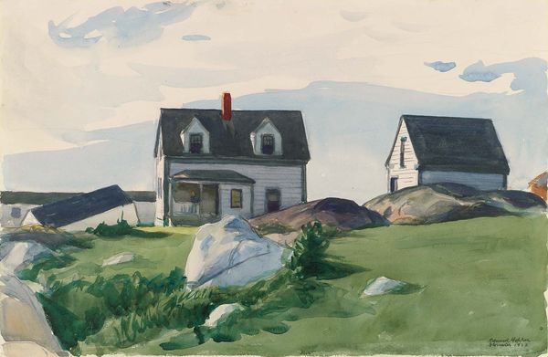
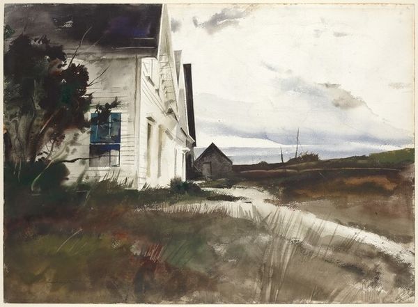
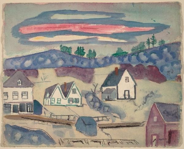
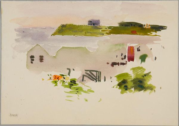
Editor: So here we have Edward Hopper's "House at the Fort, Gloucester," painted in 1924, in watercolor. There's something so isolated about it. I'm really struck by how the house seems to just perch there on the rocks. What do you make of this piece? Curator: Perched is a good word. Hopper really does give the impression that this house has weathered every kind of storm. And he’s made an exquisite little study in contrasts—the sharp, geometrical architecture alongside the rounded forms of the rocks. It almost feels like the built environment is trying to make peace with the natural one, and isn't quite there. Editor: Yes! That tension is what I find so captivating. But I also find it oddly comforting. The color palette is restricted to the subtle hue of pale blues, greens and beige. I wonder why Hopper chose that specific limited palette. Curator: I feel it echoes that sense of place, doesn't it? Think about the light on the New England coast, especially back then. It can be stark and beautiful, almost…bleached. Hopper simplifies and abstracts from reality, but never entirely loses it. There’s a touch of realism, balanced with Hopper's own introspective vision. This isn’t just a house; it’s a mood. What do you make of how the buildings are positioned in relationship to each other? Editor: It’s interesting… they almost seem to be huddling together, for protection, maybe? Like a small community facing the elements. The stark lighting adds to that, heightening the feeling of exposed vulnerability and a kind of beauty in it. Curator: Absolutely, that’s insightful. This painting becomes a quiet observation of the way humans shape their existence against, and alongside, the powerful, indifferent natural world. Hopper challenges us to find beauty in what others might overlook, that loneliness we all recognize but rarely express. Editor: I hadn’t considered that angle, it’s a fresh approach for me. The way Hopper uses light and shadow…I’m going to spend more time looking at those contrasts!
Comments
No comments
Be the first to comment and join the conversation on the ultimate creative platform.
More like this