About this artwork
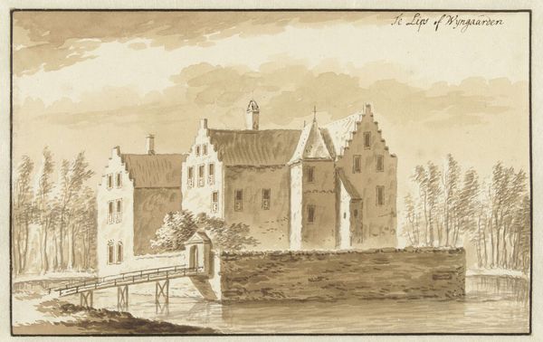
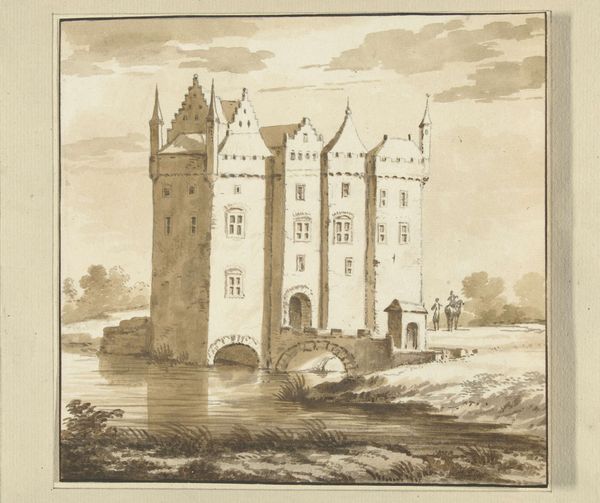
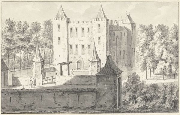
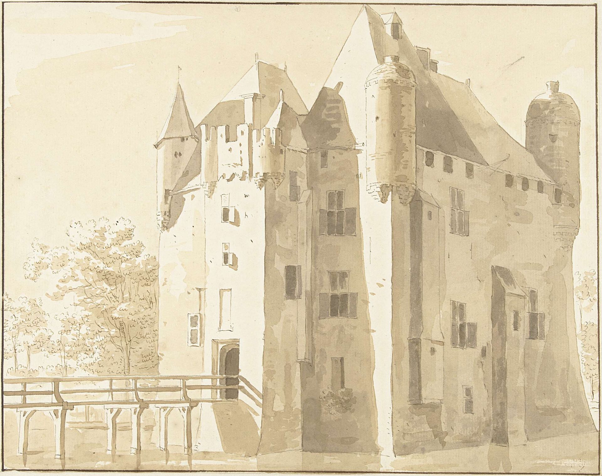
Curator: Here we have Cornelis Pronk’s “Kasteel Frissestein te Herwijnen, achterzijde,” a drawing likely rendered between 1701 and 1759. It depicts the rear view of Frissestein Castle in Herwijnen. Editor: There’s something quite imposing about this structure, isn't there? Stark and geometric in its form, despite the slightly softened ink lines. I find it immediately impressive, almost cold. Curator: The coolness you perceive might stem from what the castle represents symbolically: power, endurance, perhaps even isolation. Castles are meant to evoke strength but often suggest a self-contained, even defensive posture against the world. Notice how the bridge acts as both a connection and a barrier. Editor: Interesting point about the bridge; it certainly hints at a controlled access, a kind of material sifting of who and what can enter. But tell me more about Pronk's process. What inks and paper would he likely have been using, and what would those materials have signified within the artistic practices of the time? Was this a purely artistic endeavour, or part of a larger survey? Curator: The earthy tones – rendered in ink on paper – give it a feeling of historical document, a study perhaps more focused on architectural accuracy than expressive artistic flourish. It is likely that Pronk used iron gall ink for the darker lines, and perhaps a bistre ink wash for the lighter areas, reflecting the conventions and availability of materials for drawings in his era. He produced many of such topographical views, catering to wealthy landowners who would commission artwork of their estate. Editor: So this artwork has been used for the glorification of the elite, it reflects back on power structures. That’s pretty standard. But how would the castle as a productive unit have operated at this time? And the use of local inks…I mean it really roots this in the everyday. How do these localized details give it this unique atmosphere, this mood that almost breathes. Curator: The choice of subject, a formidable castle, becomes more than mere architecture; it becomes a stage upon which the themes of control, defense, and perhaps even the anxieties of its inhabitants, play out across the centuries, a visual embodiment of lived experience transformed into symbolic form. Editor: Yes, its connection to the material world and how that affects meaning. Very interesting, a great use of materials to illustrate hierarchy!
Kasteel Frissestein te Herwijnen, achterzijde
1701 - 1759
Cornelis Pronk
1691 - 1759Location
RijksmuseumArtwork details
- Medium
- drawing, paper, ink
- Dimensions
- height 213 mm, width 269 mm
- Location
- Rijksmuseum
- Copyright
- Rijks Museum: Open Domain
Tags
Comments
Share your thoughts
About this artwork
Curator: Here we have Cornelis Pronk’s “Kasteel Frissestein te Herwijnen, achterzijde,” a drawing likely rendered between 1701 and 1759. It depicts the rear view of Frissestein Castle in Herwijnen. Editor: There’s something quite imposing about this structure, isn't there? Stark and geometric in its form, despite the slightly softened ink lines. I find it immediately impressive, almost cold. Curator: The coolness you perceive might stem from what the castle represents symbolically: power, endurance, perhaps even isolation. Castles are meant to evoke strength but often suggest a self-contained, even defensive posture against the world. Notice how the bridge acts as both a connection and a barrier. Editor: Interesting point about the bridge; it certainly hints at a controlled access, a kind of material sifting of who and what can enter. But tell me more about Pronk's process. What inks and paper would he likely have been using, and what would those materials have signified within the artistic practices of the time? Was this a purely artistic endeavour, or part of a larger survey? Curator: The earthy tones – rendered in ink on paper – give it a feeling of historical document, a study perhaps more focused on architectural accuracy than expressive artistic flourish. It is likely that Pronk used iron gall ink for the darker lines, and perhaps a bistre ink wash for the lighter areas, reflecting the conventions and availability of materials for drawings in his era. He produced many of such topographical views, catering to wealthy landowners who would commission artwork of their estate. Editor: So this artwork has been used for the glorification of the elite, it reflects back on power structures. That’s pretty standard. But how would the castle as a productive unit have operated at this time? And the use of local inks…I mean it really roots this in the everyday. How do these localized details give it this unique atmosphere, this mood that almost breathes. Curator: The choice of subject, a formidable castle, becomes more than mere architecture; it becomes a stage upon which the themes of control, defense, and perhaps even the anxieties of its inhabitants, play out across the centuries, a visual embodiment of lived experience transformed into symbolic form. Editor: Yes, its connection to the material world and how that affects meaning. Very interesting, a great use of materials to illustrate hierarchy!
Comments
Share your thoughts