#
aged paper
#
homemade paper
#
script typography
#
paperlike
#
hand drawn type
#
hand-drawn typeface
#
thick font
#
publication mockup
#
delicate typography
#
thin font
Dimensions: height 360 mm, width 274 mm, thickness 15 mm
Copyright: Rijks Museum: Open Domain
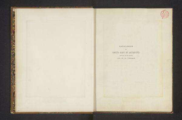
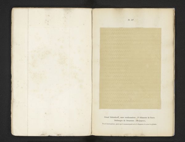
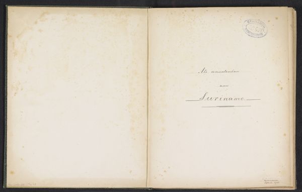
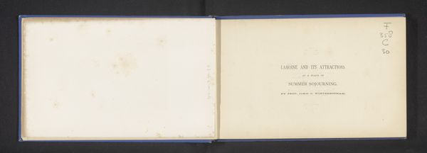
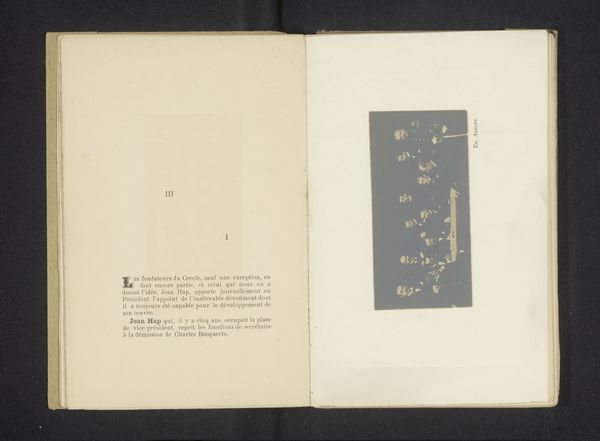
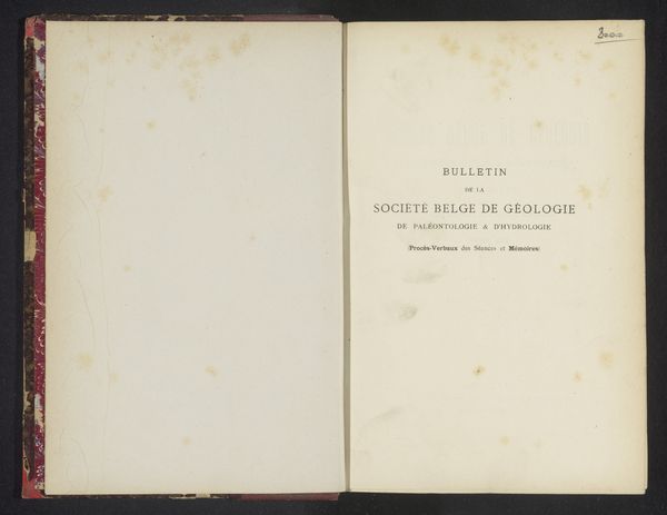
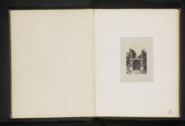
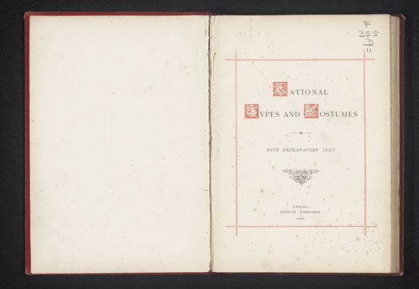
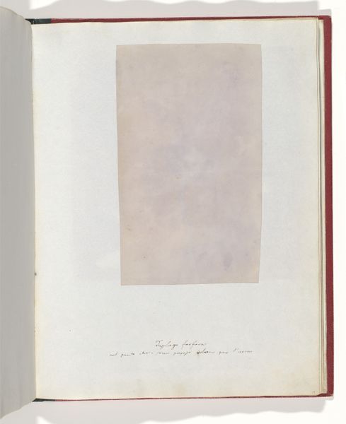
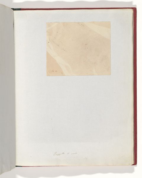
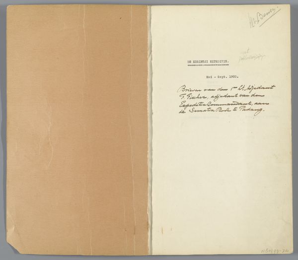
Editor: Here we have an open book titled "Vrouwenliefde en vrouwenleven" created in 1863 by Adelbert von Chamisso. The work appears to be presented on aged, homemade paper. Looking at it, I am struck by the emptiness of the spread. What do you see in this piece? Curator: Formally, one might note the stark contrast between the left page, mostly blank save for a creamy hue, and the right, bearing the titular inscription. The font itself, while delicate, projects a sense of faded formality against the slightly discolored paper. The sporadic blemishes on the page introduce a textural variation that disrupts the potential monotony of the visual field. What is your read on how the typographical choice contributes to the aesthetic? Editor: Well, the typeface, while elegant, seems almost fragile against the backdrop of the aged paper, emphasizing a sense of vulnerability, perhaps mirroring the themes of the title itself. Curator: Precisely. Observe how the thin font also plays with the surface quality. It does not dominate, but rather integrates with the paper's texture. Now, let's think about the blank space. The stark openness of the left page: does it invite interpretation, perhaps? Editor: Yes, it feels like an invitation, perhaps suggesting untapped narratives or hidden complexities relating to women's love and life. Curator: Indeed. It also begs the question of intention. Is this piece a deliberate void, or a space awaiting completion? The materiality and layout prompt us to reflect on absence and presence within representation itself. I've definitely expanded my perspective on considering artistic composition! Editor: Me too! Thanks for illuminating all those aspects!
Comments
No comments
Be the first to comment and join the conversation on the ultimate creative platform.
