Copyright: CC0 1.0
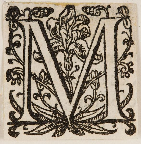
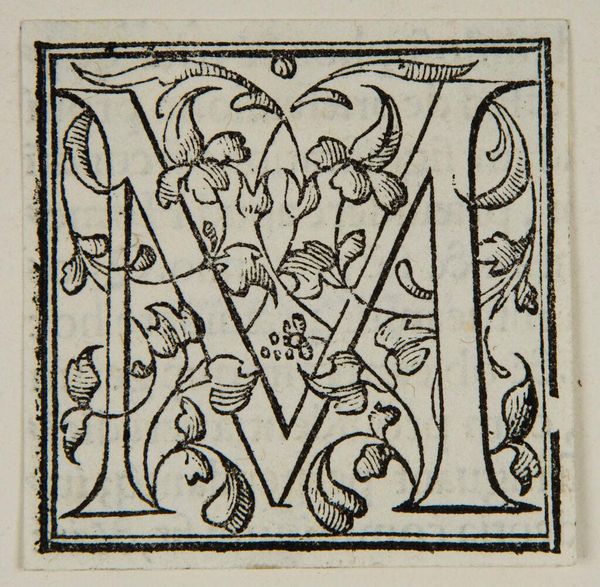
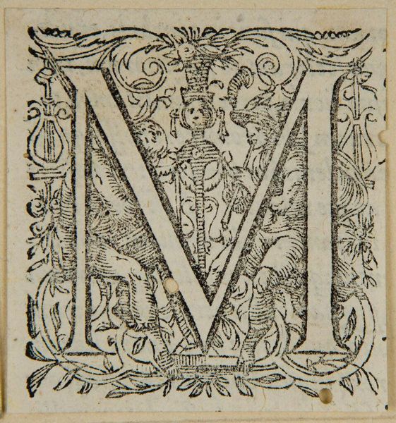
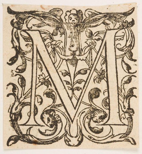
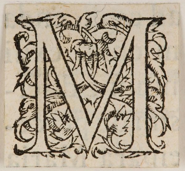
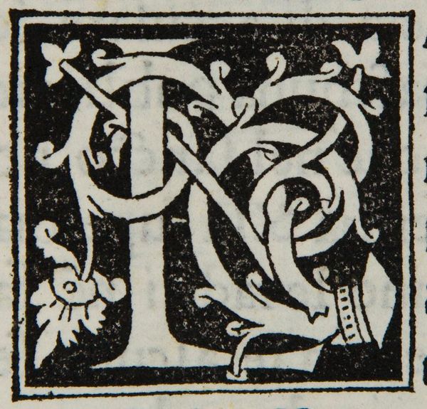
Curator: This is "Letter M," an intriguing, if unsigned, work held here at the Harvard Art Museums. Editor: My first impression is a sense of established order—the dense black ink forming sharp contrast with the white letterforms, a visual language of power and tradition. Curator: Indeed, note how the letter itself becomes ornamentation, almost obscuring its primary function. The structural elements—the serifs, the weight of the lines—are all carefully calibrated. Editor: And isn’t that precisely the point? To elevate the letter beyond mere utility, imbuing it with symbolic weight? I wonder about the original context of this letter, its purpose, and for whom it was intended. Curator: The stark contrasts create a dynamic visual interplay, drawing the eye in and around the letter. Editor: Yes, but it also speaks to rigid hierarchies and the control of knowledge during the period it was likely produced. It's a reminder that even the alphabet can be a site of power. Curator: A fascinating perspective; it gives me something to think about in future viewings. Editor: Precisely, and that’s what makes engaging with works like this so enriching, isn’t it?
Comments
No comments
Be the first to comment and join the conversation on the ultimate creative platform.
