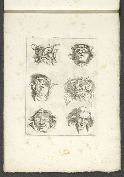
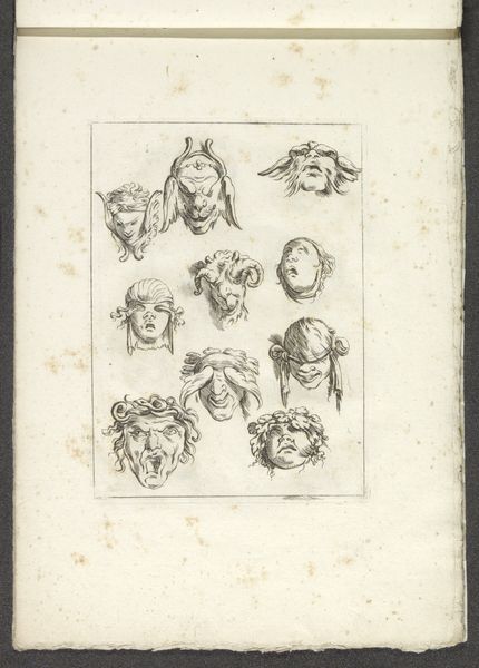
print, engraving
#
portrait
#
neoclacissism
#
light pencil work
#
quirky sketch
#
allegory
# print
#
pencil sketch
#
personal sketchbook
#
sketchwork
#
ink drawing experimentation
#
pen-ink sketch
#
sketchbook drawing
#
pencil work
#
sketchbook art
#
engraving
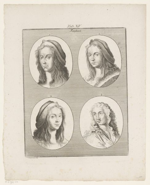
Dimensions: height 189 mm, width 152 mm
Copyright: Rijks Museum: Open Domain
Editor: We're looking at Francesco Rosaspina's "The Four Seasons," dating roughly from 1772 to 1841. It's an engraving housed in the Rijksmuseum. It strikes me as a rather intriguing sketch – what jumps out at you about the visual composition? Curator: The immediate aspect is the arrangement, four distinct portrait medallions within a single plane. This quadrant organization speaks directly to classical ideals of order and harmony. Consider, too, the consistent circular format. Editor: That's a good point. I hadn't noticed the emphasis on the circle. It really emphasizes that cyclical nature of the seasons, doesn't it? The top two appear softer compared to the two below. Curator: Precisely. The modulation from light to dark, top to bottom, creates a deliberate tonal shift, guiding the eye through the cyclical progression of the year. Observe also the detail in the etched lines: consider their density and directionality in conveying form and texture within each allegorical head. How do the formal choices serve meaning? Editor: The heavier lines for "Autumn" and "Winter" emphasize the harshness and decay of those seasons, unlike the light strokes of "Spring." I appreciate that each season seems to be crowned by distinctive vegetal matter as well. The grapes and leaves stand out. Curator: The natural elements become visual markers for each section. This allegorical framework allows the artist to delve into structural form through visual signs: Spring represented by flowers and Summer in ripe wheat. Note how each face is captured within near perfect spheres. Are you picking up on that geometry? Editor: Yes. It's not just decorative, it emphasizes a philosophical symmetry! Curator: The visual framework directs our reading. What might the relationship be of nature to form? Editor: It's been enlightening to see how Rosaspina blends symbolism with classical form to express the cycle of time. Thanks for sharing your perspective. Curator: It is my pleasure. These works encourage thoughtful meditation.
Comments
No comments
Be the first to comment and join the conversation on the ultimate creative platform.
More like this