Dimensions: height 340 mm, width 270 mm, height 241 mm, width 203 mm
Copyright: Rijks Museum: Open Domain
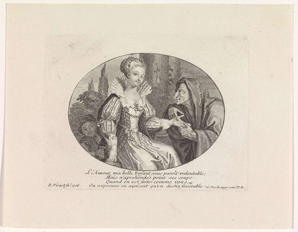
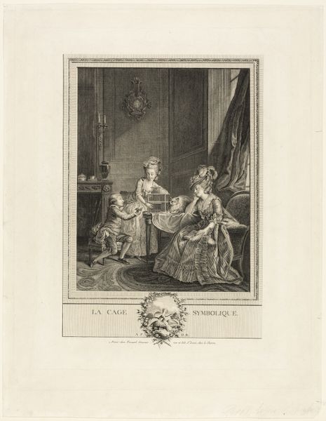
Editor: Here we have Jean François Janinet's "Portret van Catharine Rosalie Gérard" from 1779, a print utilizing etching and engraving. I'm immediately drawn to the pastel colours, and the way the oval frame contains the portrait, almost like a locket. How do you read this work, considering Janinet’s artistic choices? Curator: Focusing on the formal elements, consider the strategic use of line. Notice how Janinet uses delicate, almost ethereal lines to define the subject's clothing, contrasting this with the firmer lines that shape the oval frame. These choices contribute to the softness of the image. Do you see how this contributes to the rococo aesthetic? Editor: I do. The delicate lines definitely soften the subject, emphasizing that era’s idealised beauty standards. And it looks almost effortless. Curator: Precisely. Now observe the color palette. Janinet employs a limited range of soft pastels, primarily blues, pinks, and creams. How do these colors function within the overall composition? Editor: They definitely lend the portrait an airy, elegant feel. It feels almost dreamlike because there aren't any harsh lines. Curator: Indeed. Janinet also carefully uses watercolor, notably around the frame and the bottom. Can you appreciate how these visual techniques convey certain sensibilities? Editor: Definitely, it feels ephemeral. I appreciate your guidance with helping me to focus on line, color, and technique; those are some areas that I sometimes overlook when first engaging with an artwork! Curator: It is often in these nuances that an artwork truly speaks. And remember, the structural integrity of a piece informs its meaning just as much as any narrative element might.
Comments
No comments
Be the first to comment and join the conversation on the ultimate creative platform.
More like this