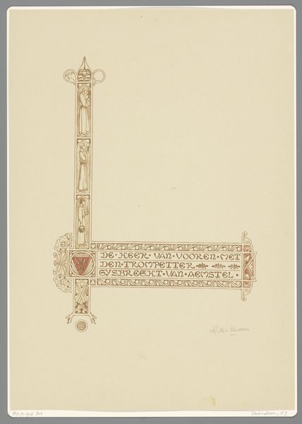
drawing, graphic-art, paper, typography, ink
#
drawing
#
graphic-art
#
art-nouveau
#
paper
#
typography
#
ink
#
line
#
decorative-art
Dimensions: height 414 mm, width 295 mm
Copyright: Rijks Museum: Open Domain
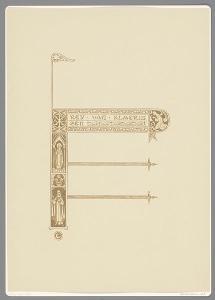
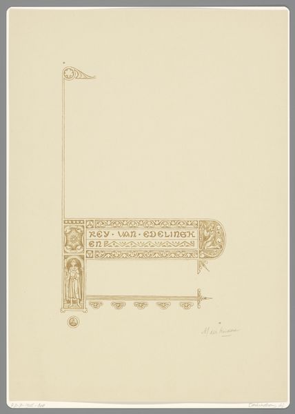
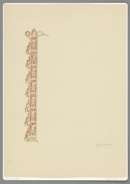
Editor: So, this is “Rey van edelinghen, Badeloch,” created by Antoon Derkinderen between 1894 and 1901. It’s ink on paper, a drawing with a distinct Art Nouveau vibe. The design is quite minimal, almost like a frame, and the typography feels very deliberate. What strikes you most about this piece? Curator: The typography indeed invites a closer look. I think it's important to situate Derkinderen’s work within the social context of the late 19th century. Art Nouveau was more than just a decorative style; it represented a desire to integrate art into everyday life, often embracing socialist and nationalist undertones. Given that, what kind of statement do you think Derkinderen might be trying to make here by placing this lettering against what otherwise is quite minimalist negative space? Editor: That’s interesting. So you’re saying it's less about aesthetics and more about communicating a specific cultural or political identity? Is there a story in these figures mentioned, Rey van edelinghen and Badeloch? Curator: Exactly. Consider this typography and decorative design as a conscious effort to connect to the Dutch national consciousness. As to your question about these figures, indeed: Rey van edelinghen is a historical figure and a character in a play from Vondel. In light of this, and further considering Art Nouveau and Dutch nationalism, how can this print function as a medium through which stories are retold and cultural values reasserted? Editor: That recontextualizes the image entirely. It becomes a kind of...visual argument for celebrating national identity through design. I thought it was purely decorative, but it seems charged with meaning. Curator: Precisely. Understanding the historical and cultural context is critical to fully engage with artworks like these. What was initially viewed as ornamentation actually becomes a voice within a broader political and cultural conversation. Editor: I definitely see that now. I’ll never look at typography the same way again.
Comments
No comments
Be the first to comment and join the conversation on the ultimate creative platform.
More like this