Dimensions: height 343 mm, width 434 mm
Copyright: Rijks Museum: Open Domain
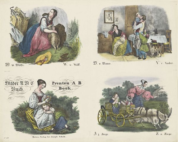
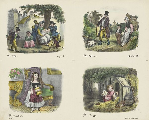
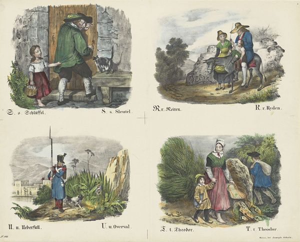
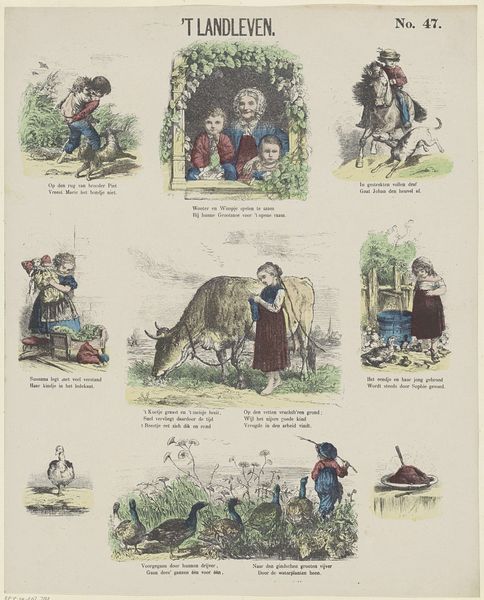
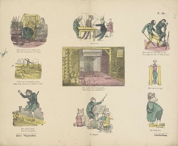
Editor: This print, "Letters W, V en Z" made by firma Joseph Scholz sometime between 1829 and 1880… It reminds me a bit of a children's book illustration, but with a touch of 19th-century Romanticism in its landscapes. What strikes you most about this piece? Curator: What immediately catches my eye is how these seemingly simple scenes reinforce very specific social roles and expectations. Think about it: a woman tending sheep, another caring for children, a father returning home… These images weren't just educational; they were actively shaping perceptions of gender and family during a period of significant social upheaval. Editor: So, it’s not just a charming alphabet book? Curator: Exactly. The landscapes, while seemingly idyllic, subtly reinforce the idea of women's confinement to the domestic sphere, while men occupy a space of authority and providers. We can view the romanticization of the family here as an effort to normalize a particular patriarchal structure and to promote traditional family values at a time when they were being challenged. And what do you make of the fact that the image is presented in both German and, presumably, Dutch? What purpose might that serve? Editor: Interesting. I hadn't considered how the languages might signify a shared set of cultural values they wanted to impart. Curator: Precisely. It invites us to critically examine the power dynamics embedded within these images and their ongoing relevance to discussions about gender, labour, and social constructs. Editor: I never thought an alphabet print could be so complex. It definitely makes me think differently about children's media from that time! Curator: Exactly! It shows how even the simplest artworks can hold rich layers of cultural meaning, and invites us to consider from what perspectives it speaks.
Comments
No comments
Be the first to comment and join the conversation on the ultimate creative platform.