Copyright: Public Domain: Artvee
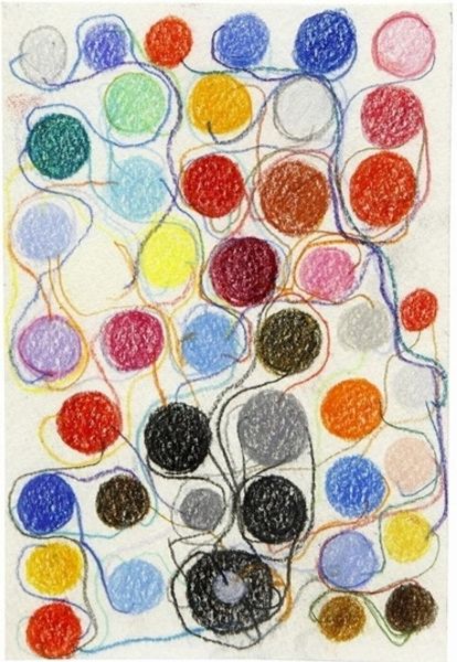
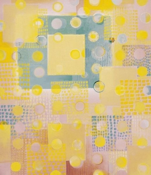
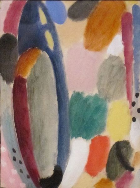
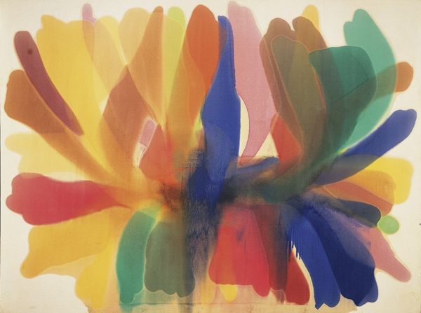
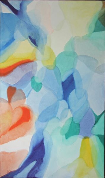
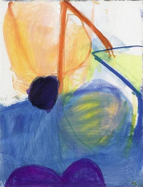
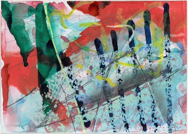
Editor: We’re looking at Paul Klee’s “Flourishing” from 1934, created with watercolor. The delicate layers of color and simple shapes almost give it a childlike whimsy. What strikes me most is how such simple lines and dots can suggest growth and vibrancy. How do you interpret this work through a formal lens? Curator: It is fruitful to observe the orchestration of color. Klee employs a pointillist-like application, disrupting smooth surfaces in favour of tonal variations, with discrete marks. We also find here the juxtaposition of the rigidity of geometric elements – circles and straight lines - against a seeming field of unbounded variation of tones. This produces a fascinating dialogue in pictorial construction. Editor: The composition definitely feels very considered, even with its delicate nature. Do you think the relationship between those strict lines and dispersed dots suggests something intentional about how Klee structured the piece? Curator: Indeed. The tension between order and apparent chaos is pivotal here. Klee masterfully navigates this dichotomy, creating a visually engaging surface. The intersecting lines and fragmented shapes evoke a dynamic structure. The colour selection plays a fundamental role in unifying these formal components. What observations might you offer about colour in this watercolour work? Editor: I'd say that the harmonious colors make it a joyful painting and it’s fascinating how he manages to do it with watercolor techniques. Curator: Precisely. Through examining Klee’s "Flourishing," we recognize the potential for profound expression residing within the interplay of simple geometric form and colouristic sensibility. Editor: Thanks! I am now able to perceive it more formally. Curator: It has been my pleasure to discuss the artistic achievement within Klee’s composition with you.
Comments
No comments
Be the first to comment and join the conversation on the ultimate creative platform.
