#
blue ink drawing
#
childish illustration
#
cartoon sketch
#
personal sketchbook
#
sketchbook drawing
#
watercolour illustration
#
cartoon style
#
storyboard and sketchbook work
#
cartoon carciture
#
sketchbook art
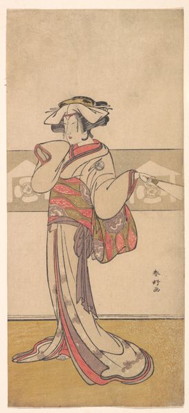
Dimensions: height 212 mm, width 135 mm
Copyright: Rijks Museum: Open Domain
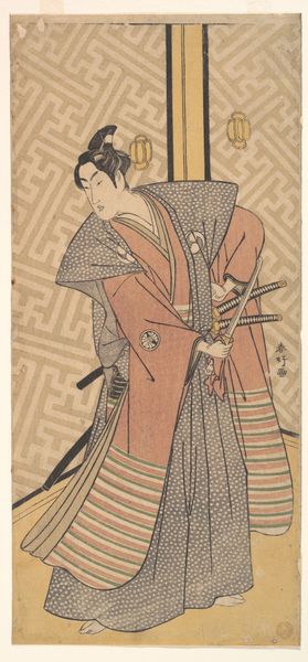
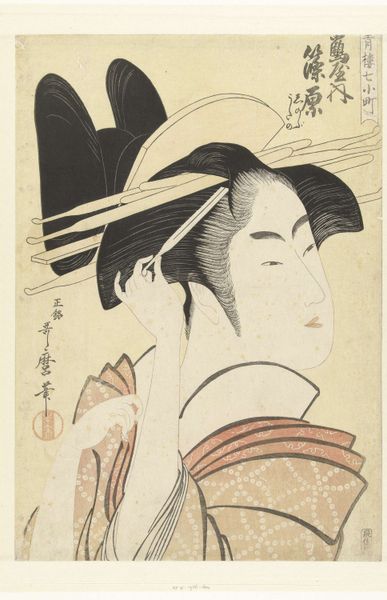
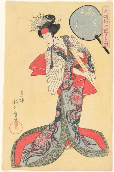
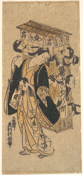
Editor: This is an advertising card from A. Sinkel featuring a Japanese woman; it was created sometime between 1874 and 1935. I'm immediately drawn to its simplicity, the almost cartoonish quality. It feels very stylized. What do you make of it? Curator: It whispers a story of cultural exchange, doesn’t it? A Dutch company using Japanese aesthetics to sell its wares. I see a confluence of worlds – the precision of Japanese woodblock prints blended with the direct, commercial needs of a European advertiser. There’s a deliberate flattening of perspective; do you notice how it almost feels like looking at a playing card? It's a distilled essence of Japan, perhaps a romanticized version. And tell me, what kind of feelings does that palette evoke in you? Editor: I get a sense of calm, but also a feeling of something slightly…artificial? I suppose that comes from knowing it's an advertisement, selling a vision of the "exotic." Curator: Precisely! That tension between serenity and artifice is where the real story lies. This image acted as a kind of portal for consumers. And that name, “A. Sinkel” written right there, a bold statement in the landscape of delicate floral motifs. Editor: So, it's about more than just a pretty picture? Curator: Always. It’s about desire, aspiration, and the fascinating dance between cultures when commerce enters the stage. It makes me wonder, what did people truly *see* when they looked at this? Editor: I never thought of it that way before. Now I see layers that were invisible at first glance! Curator: That’s the magic, isn’t it? A simple image, holding within it a whole universe of ideas. It almost has you looking at commerce like poetry.
Comments
No comments
Be the first to comment and join the conversation on the ultimate creative platform.
More like this