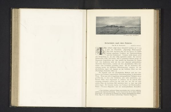
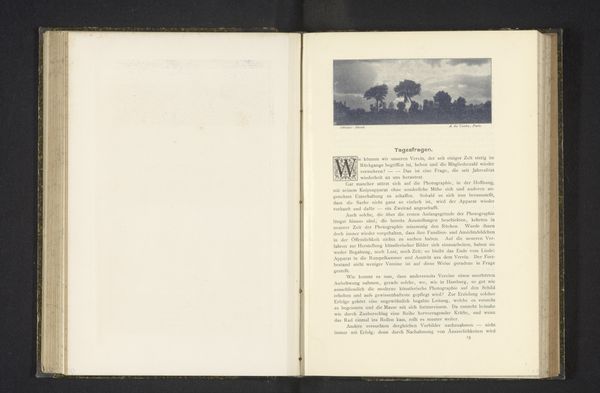
print, photography, collotype
# print
#
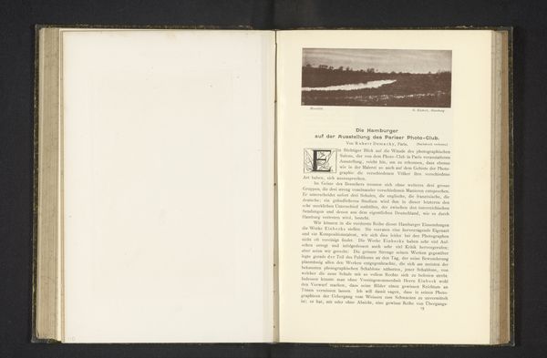
river
#
photography
#
collotype
Dimensions: height 31 mm, width 80 mm
Copyright: Rijks Museum: Open Domain
Editor: Here we have a page from a book featuring “Gezicht op een rivier in een stad,” or “View of a River in a City” by A. Miethe, created before 1898. The mediums are listed as print, photography, and collotype. It's striking how this image, presented within a text, feels almost like a miniature window. I am curious; what compositional elements stand out to you the most? Curator: Note the careful arrangement of tonal values, ranging from the dark, richly textured pages to the subtle gradations within the collotype print itself. Consider how the artist has employed light and shadow to create depth. Notice, also, the rigid frame that contains the photograph, an indicator of photography's desire to be legitimized as a Fine Art, at that time. Editor: That’s an interesting detail. The framing definitely gives it a formal feel, almost like a study. How does this affect the viewer's experience? Curator: By emphasizing the contrast between the textured, tactile quality of the paper and the smooth surface of the photographic image, the artist highlights the medium specificity. One must ask, how do these formal choices contribute to a deeper understanding? How is this a novel combination? Editor: I see how the interplay between the different textures really draws attention to the materials themselves. Curator: Exactly! Consider how this reflects the aesthetic concerns of the late 19th century. Editor: It’s fascinating to see how close observation of form and materiality opens up new ways of understanding the work! Curator: Indeed, focusing on the elements provides a rigorous foundation for interpretation.
Comments
No comments
Be the first to comment and join the conversation on the ultimate creative platform.
More like this