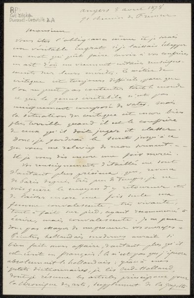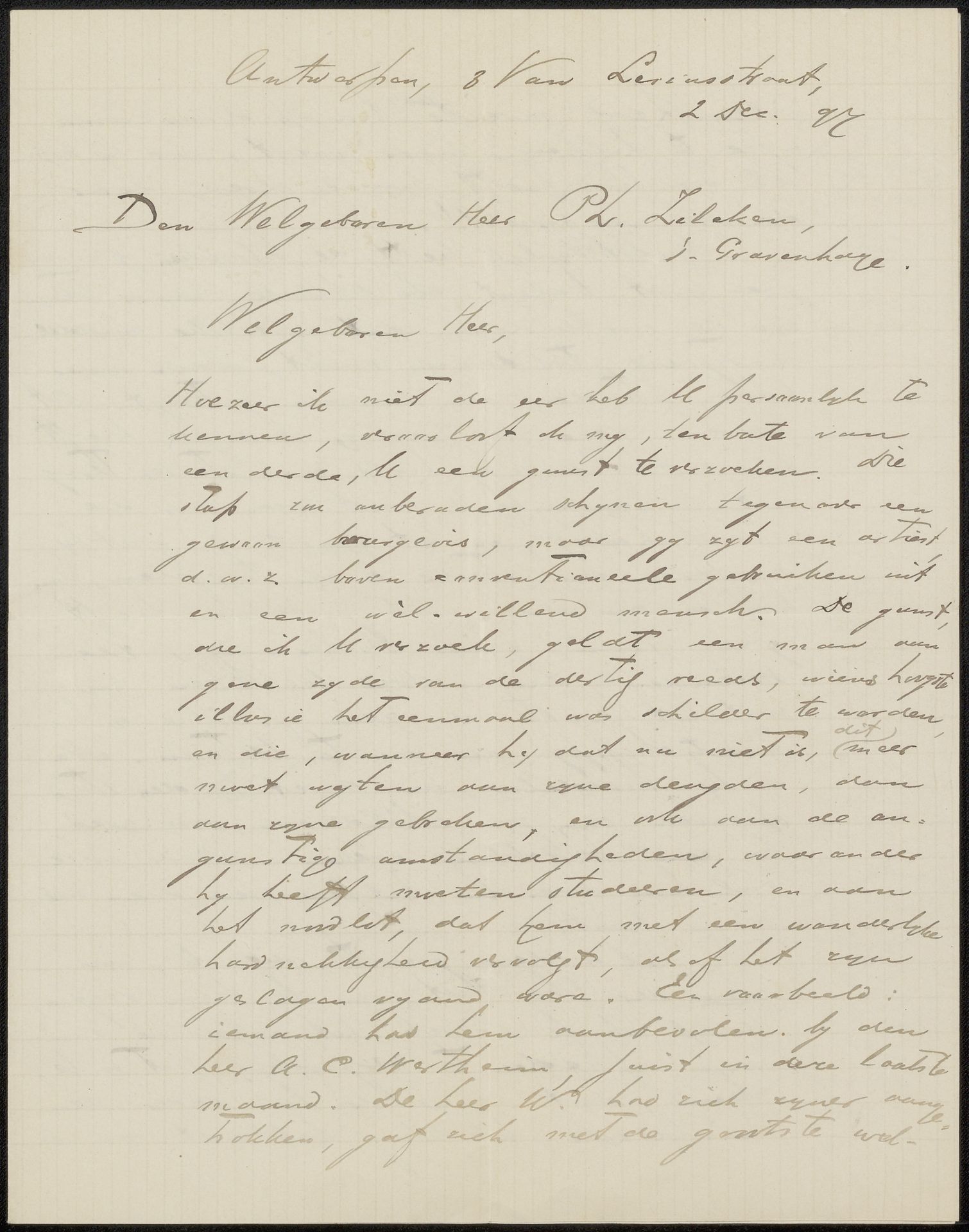
Possibly 1897
Brief aan Philip Zilcken
Listen to curator's interpretation
Curatorial notes
Curator: This artwork, "Brief aan Philip Zilcken," potentially dating back to 1897, intrigues me. It is a drawing in ink on paper. The lines of the lettering create a certain rhythm across the page. How would you describe the visual impact of this piece? Editor: Well, the calligraphy definitely strikes me first. It’s not the most legible script, but the shapes and forms the letters make create a beautiful, almost abstract, design. What else do you see in this work beyond its purely functional aspect as a letter? Curator: Function is interesting. While the letter serves to communicate, its artistic merit lies in the intentionality of its construction. Note how the placement of text is balanced with a careful deployment of the negative space; even the slightly imperfect grid provides an underlying order. Would you agree? Editor: Yes, definitely. The neat lines give some control. Even though it is handwritten, and of its time, that attention to form gives it a structured feel that is beyond just scribbling a note. Are the textural qualities of the paper also important, do you think? Curator: Undeniably. The paper’s texture interacts with the ink, influencing the line's quality and density. Furthermore, the ageing of the paper introduces tonal variations, contributing to the visual depth. Editor: I see, it's not just about what's written, but *how* it’s presented, that elevates it to art. Curator: Precisely! The material and construction, through the artist's choices, produce a stimulating viewing experience, exceeding the letter's intrinsic function. The convergence of form and intentional design is what I find most profound about this piece. Editor: This formal breakdown really highlighted details I wouldn't have thought about on my own! Thank you.