graphic-art, mixed-media, ink, poster
#
portrait
#
art-deco
#
graphic-art
#
mixed-media
#
figuration
#
word art
#
ink
#
poster
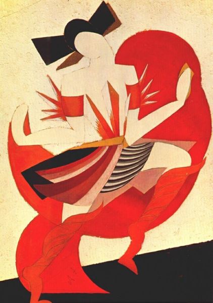
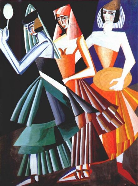
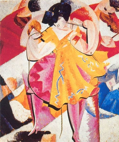
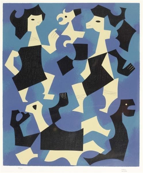
Copyright: Bernardo Marques,Fair Use
Bernardo Marques made this magazine cover, Civilização, No. 1, and look at the way he uses a limited palette to create something really dynamic and eye-catching! It’s a reminder that artmaking is a process of making choices, of figuring out what to leave in and what to take out. The texture feels smooth, like it’s printed, and the colors are really flat, adding to that crisp, graphic feel. I love the way he uses pink as a pop, accentuating the playful frills of the costumes. And check out those legs, right? They’re so stylized, like they go on forever. What I find interesting is how the background color seeps into the figures, giving the feeling of them emerging from it rather than being placed on top of it. It makes the figures feel less real and more like cut outs or apparitions. It reminds me a bit of the Italian futurist artist, Giacomo Balla, in the way that it tries to show movement and energy through repeated forms. Like Balla, Marques captures a specific moment in time, an enthusiasm for modernity and new forms of expression. Art's not about answers, it's about keeping the conversation going, right?
Comments
No comments
Be the first to comment and join the conversation on the ultimate creative platform.
More like this