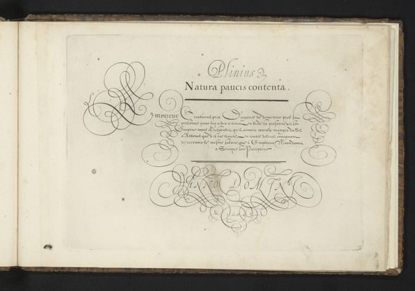
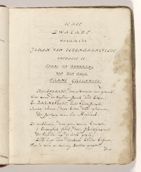
Titelblad van het album van de uniformen van het Genootschap tot Nut der Schutterij te Amsterdam in 1787 1787
0:00
0:00
print, paper, typography
#
script typeface
#
aged paper
#
script typography
#
dutch-golden-age
# print
#
hand drawn type
#
paper
#
personal sketchbook
#
typography
#
hand-drawn typeface
#
fading type
#
thick font
#
handwritten font
#
historical font
Dimensions: height 313 mm, width 225 mm
Copyright: Rijks Museum: Open Domain
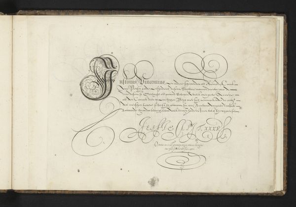
This is the title page from a 1787 album, depicting the uniforms of the Civic Guard of Amsterdam, created by an anonymous artist. The stark contrast of black typography against the aged, off-white paper creates a striking visual harmony, evoking a sense of historical gravitas. Observe the meticulous arrangement of text; the artist employs varied fonts and decorative flourishes to emphasize key words, creating a visual hierarchy that guides the viewer's eye. The use of calligraphic elements, such as the embellished ‘G’ and ‘S’, adds a layer of intricacy to the otherwise simple composition. The structural clarity of this title page can be seen as a reflection of the Enlightenment values of order and reason. This seemingly straightforward design engages with semiotic systems; the lettering acts not only as text but as a signifier of the era's aesthetic and intellectual sensibilities. The formality evident in the typeface embodies the societal structures and cultural codes of 18th-century Amsterdam.
Comments
No comments
Be the first to comment and join the conversation on the ultimate creative platform.
More like this