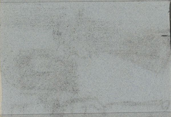
drawing, pencil
#
drawing
#
landscape
#
pencil
#
abstraction
#
realism
#
monochrome
Copyright: Vija Celmins,Fair Use
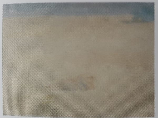
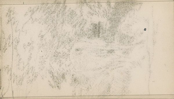
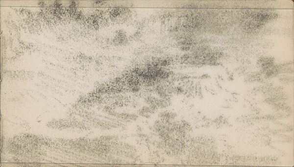
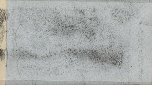
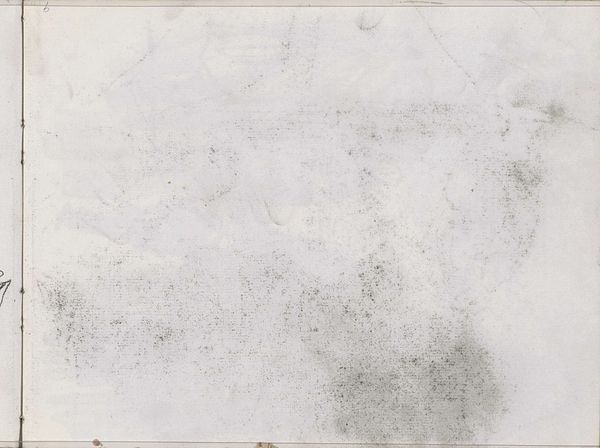
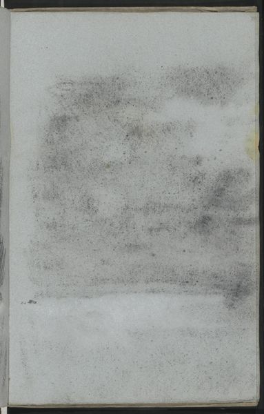
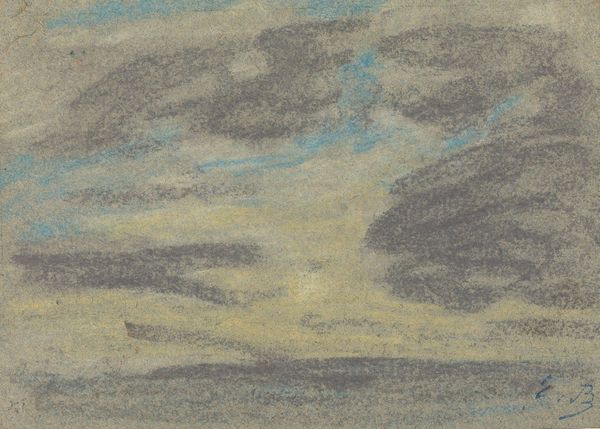
Curator: We are looking at Vija Celmins’ pencil drawing titled “Sky,” created in 1975 and now part of the collection at Tate Britain. Editor: It has such a quiet, almost unsettling mood, doesn’t it? The density of the marks across the composition creates a flat picture plane despite depicting something with infinite depth, like the sky. Curator: Absolutely. This tension is at the heart of her practice. Consider her painstaking rendering technique; Celmins focuses not just on representing reality but also on the labor and materiality involved in the art-making process. Her hyperrealism borders on abstraction through process. Editor: It makes me think about how the social and political climate during the 1970s fostered a shift towards more introspective art. You see artists turn away from grand narratives toward quiet observations, which is clear in this piece. The subtle variations in tone create a sense of infinite space, but without any dramatic gesture, and how that fits into ideas about the ordinary as subject. Curator: Yes. Semiotically speaking, this work challenges our ingrained perceptions. Clouds are inherently transient, yet Celmins renders them permanent, fixed through graphite. It transforms our viewing experience from momentary observation into prolonged contemplation. The monochromatic palette also limits easy readings of depth that chromatic aberration could signal to the viewer. Editor: Beyond individual introspection, “Sky” embodies a broader sense of environmental consciousness emerging at that time, particularly given the way institutions would re-frame nature's place in everyday culture. Here, the sky is not just an aesthetic feature; it becomes something we contemplate and study almost scientifically because the marks denote visual information about the real world. Curator: Well observed! What interests me most, structurally, is how the dispersal of tone and weight balances the piece overall; the drawing almost becomes an object that is as heavy as any other, its pictorial components reduced to pure value gradations. Editor: Agreed. It invites viewers to slow down, observe the ordinary, and perhaps, appreciate our fragile relationship with the natural world and question art's role in directing the audience toward seeing a subject anew. Curator: A quiet piece capable of fostering some really lively discussion. Thank you! Editor: My pleasure. Its silence really spoke volumes to me.
Comments
No comments
Be the first to comment and join the conversation on the ultimate creative platform.
More like this