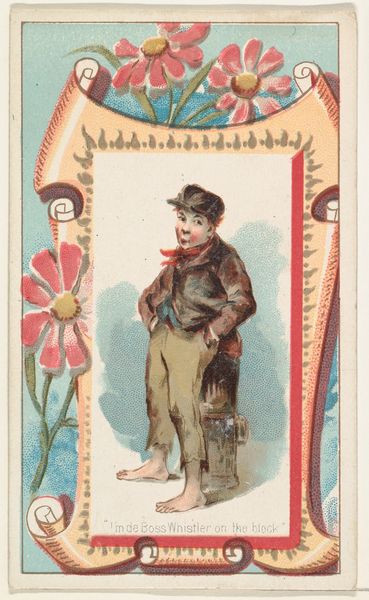
"I'm de Boss Whistler on the block," from the Terrors of America set (N136) issued by Duke Sons & Co. to promote Honest Long Cut Tobacco 1888 - 1889
0:00
0:00
drawing, coloured-pencil, print
#
drawing
#
art-nouveau
#
coloured-pencil
# print
#
caricature
#
coloured pencil
#
art nouveau
#
genre-painting
Dimensions: Sheet: 2 3/4 x 1 1/2 in. (7 x 3.8 cm)
Copyright: Public Domain
Curator: This small but engaging piece is titled "\"I'm de Boss Whistler on the block,\" from the Terrors of America set (N136)" created circa 1888-1889 by W. Duke, Sons & Co. Editor: Immediately, I'm struck by the contrasting design elements. The central figure is quite realistically rendered, while the framing motifs embrace the playful curves of Art Nouveau. Curator: Absolutely. The composition uses a rather classic figure-ground relationship. Our subject is firmly positioned against a backdrop, within the ornate, period-specific frame. We should mention it's a color print made using colored pencils. Editor: This leads us to consider production; tobacco cards like these were essentially early forms of advertisement. Their disposable nature means labor was fast, possibly piece-work, using popular aesthetics for visual appeal. Curator: Agreed, we must consider that this image functioned within a very specific consumerist landscape. Note the slightly awkward pose—one hand in pocket, the other leaning on what appears to be a streetlamp, an element crucial in establishing the urban environment. This could represent a socio-economic commentary. Editor: It is more an embellishment and romanticism of youth than harsh realities in this depiction of "terrors of america". The tears in his pants, and lack of shoes is a clear nod to that, in combination with the material context, mass production implies circulation and access. Curator: Your emphasis on materiality broadens our interpretation, highlighting the democratizing function of such objects. But focusing again on design, look how the diagonal of the body from head to feet establishes dynamic visual tension against the more rigid structure of the frame. Editor: Fair enough; I would rather stress that we’re speaking about factory processes as much as aesthetics; these materials—the card stock, colored pencils— were part of a huge industrialized economy that fueled and shaped what we know now about consumer trends in that era. Curator: Perhaps, in closing, we might agree that its design intricacies and methods used reflect that this art's formal aspects and material history merge into a captivating visual record, inviting viewers to consider commercial contexts of fine art of that era? Editor: Precisely; this work highlights how commercial, everyday artifacts and artistic intentions combine, offering a unique lens through which we engage labor practice and consumer culture then and now.
Comments
No comments
Be the first to comment and join the conversation on the ultimate creative platform.
More like this