About this artwork
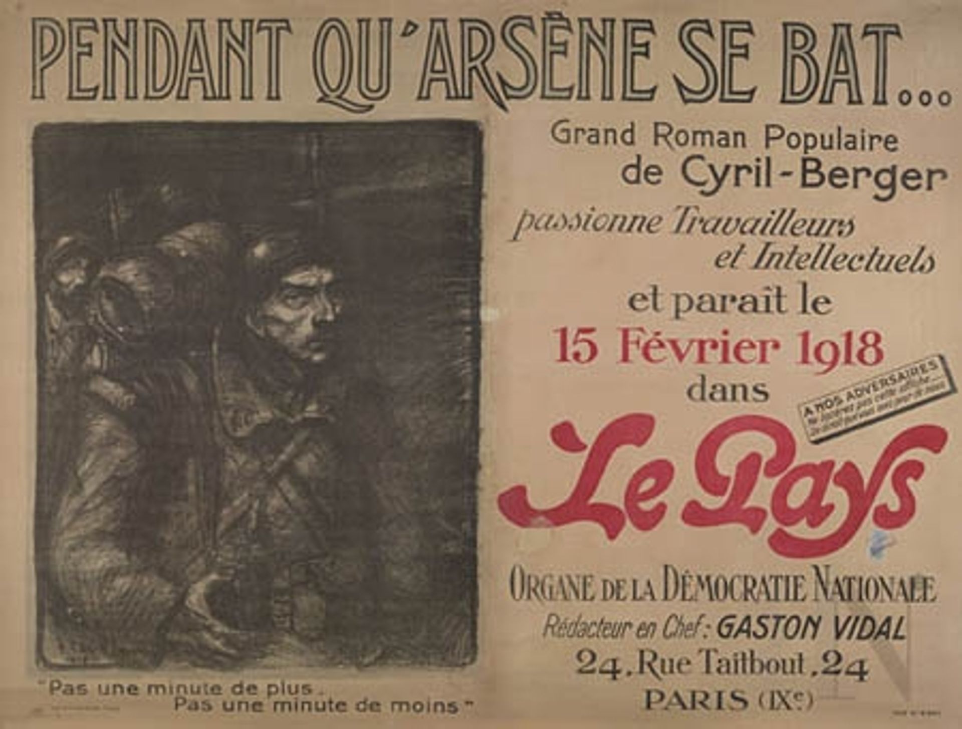
Curator: I'm drawn to the palpable gloom of Théophile Alexandre Steinlen's lithograph from 1918, titled "Pendant Qu'Arsene se bat…" It’s a promotional poster, I believe. What do you think initially? Editor: Immediate reaction: stark. That charcoal palette evokes the grit and grim reality of war. The lettering is both assertive and fragile; notice how the thick font struggles to stay legible against the somber lithographic field. The materiality of this print, this deliberate choice, is just whispering its own narrative of wartime austerity and constraint. Curator: Absolutely. Steinlen, known for his social commentary, created this to advertise a novel—a "Grand Roman Populaire" by Cyril-Berger published in the paper *Le Pays*. The contrast between the idealized promise of escapist fiction and the war's somber reality is biting. The men depicted seem burdened, almost spectral. The inclusion of workers and intellectuals suggests a book written with everyone in mind, for everyone's escapism or comfort at the time. Editor: I’m fascinated by how the layout directs our gaze. We have this raw, almost expressionistic portrayal on one side; look at the men's haunted eyes! And on the other, these optimistic pronouncements about democracy and intellectual pursuits and such...in this kind of font of the era, this becomes a critical comparison about cultural production during wartime, really highlighting this dissonance between propagandistic language and lived experience of conflict. Curator: Precisely. And look at the phrases at the bottom—"Pas une minute de plus, pas une minute de moins." This constant pressure of time passing during war, time moving quickly or slowing down at random, which offers another layer of the war-time pressure people endured. This whole print speaks volumes about the mental state of the people. I am now imagining this work scaled up on the street, as originally intended, to draw them to the printed text of the book inside, or the daily paper. It must have provided some comfort for some readers at the time. Editor: It really invites us to contemplate the very act of production—the making of art, the publishing of narratives—under immense social and material strain. A paper shortage would impact on *Le Pays*, surely affecting its form, production, availability to readers. Each copy of this print may have required specific labors in procurement, processing, labor. That is such an active, dynamic part of its life. Curator: It seems to have created its impact regardless, wouldn't you agree? I can’t help but wonder about its continuing relevance to us, still so full of resonance a century later. Editor: I do agree. Looking at its components now, even reduced to its separate words and elements, this lithograph gives so much voice to all these concerns and it's a gift that the poster's makers wanted everyone to benefit from such insights, workers and intellectuals, then as much as now.
Artwork details
- Medium
- lithograph, print, poster
- Copyright
- Public domain
Tags
portrait
hand-lettering
narrative-art
lithograph
war
hand drawn type
hand lettering
figuration
text
personal sketchbook
hand-written
hand-drawn typeface
fading type
expressionism
thick font
handwritten font
poster
small lettering
Comments
Be the first to share your thoughts about this work.
About this artwork
Curator: I'm drawn to the palpable gloom of Théophile Alexandre Steinlen's lithograph from 1918, titled "Pendant Qu'Arsene se bat…" It’s a promotional poster, I believe. What do you think initially? Editor: Immediate reaction: stark. That charcoal palette evokes the grit and grim reality of war. The lettering is both assertive and fragile; notice how the thick font struggles to stay legible against the somber lithographic field. The materiality of this print, this deliberate choice, is just whispering its own narrative of wartime austerity and constraint. Curator: Absolutely. Steinlen, known for his social commentary, created this to advertise a novel—a "Grand Roman Populaire" by Cyril-Berger published in the paper *Le Pays*. The contrast between the idealized promise of escapist fiction and the war's somber reality is biting. The men depicted seem burdened, almost spectral. The inclusion of workers and intellectuals suggests a book written with everyone in mind, for everyone's escapism or comfort at the time. Editor: I’m fascinated by how the layout directs our gaze. We have this raw, almost expressionistic portrayal on one side; look at the men's haunted eyes! And on the other, these optimistic pronouncements about democracy and intellectual pursuits and such...in this kind of font of the era, this becomes a critical comparison about cultural production during wartime, really highlighting this dissonance between propagandistic language and lived experience of conflict. Curator: Precisely. And look at the phrases at the bottom—"Pas une minute de plus, pas une minute de moins." This constant pressure of time passing during war, time moving quickly or slowing down at random, which offers another layer of the war-time pressure people endured. This whole print speaks volumes about the mental state of the people. I am now imagining this work scaled up on the street, as originally intended, to draw them to the printed text of the book inside, or the daily paper. It must have provided some comfort for some readers at the time. Editor: It really invites us to contemplate the very act of production—the making of art, the publishing of narratives—under immense social and material strain. A paper shortage would impact on *Le Pays*, surely affecting its form, production, availability to readers. Each copy of this print may have required specific labors in procurement, processing, labor. That is such an active, dynamic part of its life. Curator: It seems to have created its impact regardless, wouldn't you agree? I can’t help but wonder about its continuing relevance to us, still so full of resonance a century later. Editor: I do agree. Looking at its components now, even reduced to its separate words and elements, this lithograph gives so much voice to all these concerns and it's a gift that the poster's makers wanted everyone to benefit from such insights, workers and intellectuals, then as much as now.
Comments
Be the first to share your thoughts about this work.