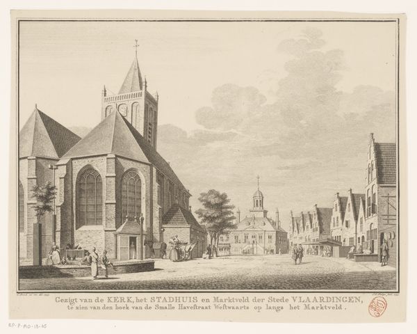
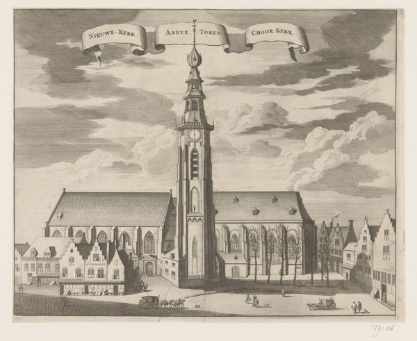
drawing, print, ink, engraving
#
drawing
#
pen drawing
#
dutch-golden-age
# print
#
landscape
#
perspective
#
ink
#
line
#
cityscape
#
engraving
#
realism
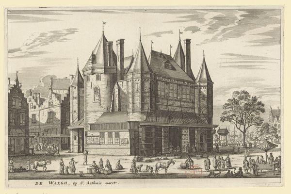
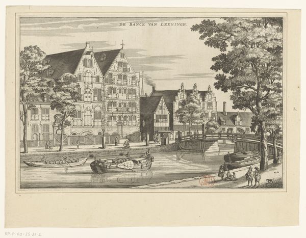
Dimensions: height 191 mm, width 296 mm
Copyright: Rijks Museum: Open Domain
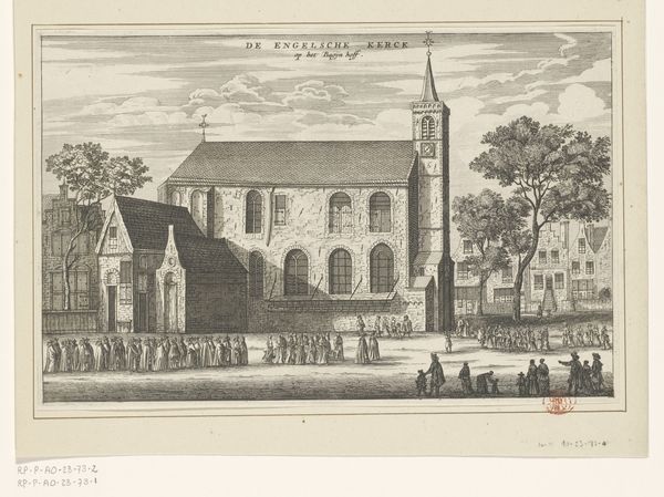
Curator: The artwork before us, titled "Gezicht op het Athenaeum Illustre te Amsterdam," was crafted between 1663 and 1664 by Jacob van Meurs. It's currently held in the Rijksmuseum's collection. Editor: It has a very balanced composition. The verticality of the buildings and trees is nicely countered by the horizontal water, creating a serene and ordered feel. Curator: Indeed. Van Meurs used ink and engraving techniques to depict this cityscape. We see line work that emphasizes form and perspective. Consider, though, the economic context. Printmaking like this was relatively accessible; it democratized images of Amsterdam for a growing merchant class. Editor: Absolutely, but note how the repetitive lines create depth and texture. The tonal range is limited, yet he manages to suggest light playing across the facades and foliage with variations in line density. It gives definition to form and structure of the buildings, very crisp lines. Curator: Think also of the labor involved in such detailed work. Each line is a product of careful crafting and contributes to making such print and images of Amsterdam available. What would it mean for them to acquire them, see their homes reproduced, exchanged? It all added to the making of Amsterdam identity at the time. Editor: While I recognize that labor is essential to art production, the interplay of light and shadow here creates a sophisticated composition with rhythmic arrangements; see how the forms relate, divide the space and convey meaning with the various formal elements employed by Van Meurs! The formal choices lead the viewer’s eyes on a well-structured composition. Curator: Of course, we can consider the engraving simply on terms of composition or effect. But ignoring the materiality and conditions of making means missing a great deal of historical understanding and impact the image would have then. Editor: Perhaps, but looking through this particular arrangement of line, form, texture and light in relationship provides its own meaning, reflecting back to us the era that developed it and offering to us to learn new concepts through a language all its own. Curator: That’s interesting to consider; thank you for bringing new context to my understanding of it. Editor: Likewise; it’s valuable to consider this piece's physical creation and place in the world, alongside its form.
Comments
No comments
Be the first to comment and join the conversation on the ultimate creative platform.
More like this