#
comic strip sketch
#
pen drawing
#
pen illustration
#
pen sketch
#
personal sketchbook
#
pen-ink sketch
#
pen work
#
sketchbook drawing
#
storyboard and sketchbook work
#
sketchbook art
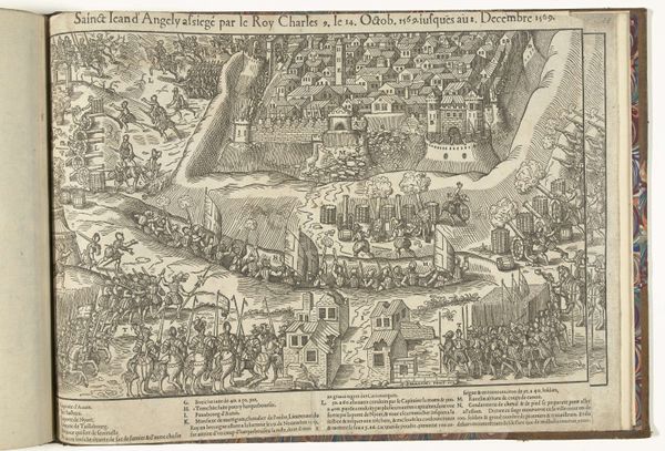
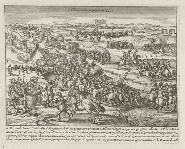
Dimensions: height 386 mm, width 505 mm
Copyright: Rijks Museum: Open Domain
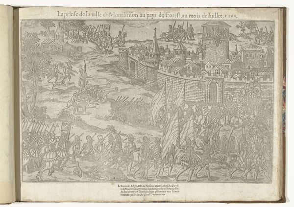
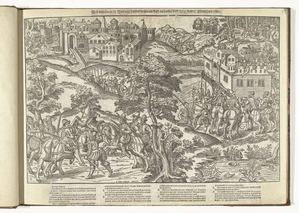
Editor: We're looking at "Montbrison ingenomen door Des Andrets, 1562" by Jean Perrissin, created around 1570. It looks like an ink drawing. It's fascinating how much detail he’s packed into this scene. The composition is very active. What strikes you most about this work? Curator: Note the complex interplay of lines; observe how the density of linework contributes to a sense of depth and spatial organization. The varying textures, achieved solely through line, are remarkable. Are you noticing how the composition leads the eye through the scene? Editor: Yes, from the cannons at the lower left up to the besieged city. The overlapping figures create depth, but the style is very flat and linear. It’s like a tapestry. Curator: Exactly. Note the deployment of recurring motifs and how this structure affects the image’s readability and coherence. The semiotician Roland Barthes termed this kind of visual rhetoric a "system of meaning." What meaning, then, arises for you from this orchestration of forms and lines? Editor: The rigidity of the lines and the overall order makes the conflict look surprisingly organised, like a formal event. Is that something that relates to this period's ideas about warfare? Curator: One could examine the artwork within a theoretical framework of structuralism, identifying underlying patterns and relationships. How would the reading change if the rendering of the lines was more chaotic? Editor: It would completely shift the feeling! If it were messier, I'd probably focus more on the violence. Curator: Precisely! By analysing the pictorial structure itself, we gain insights into the possible connotations of this artwork. Editor: It’s interesting how much the artistic choices influence the meaning, independently of historical context. I'll definitely pay more attention to the line work from now on!
Comments
No comments
Be the first to comment and join the conversation on the ultimate creative platform.
More like this