Curatorial notes
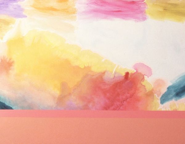
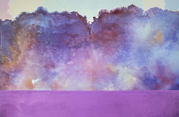
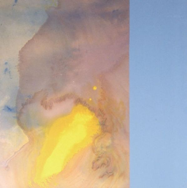
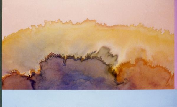
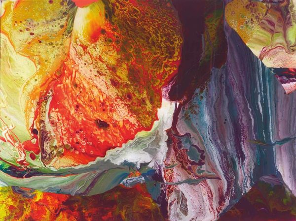
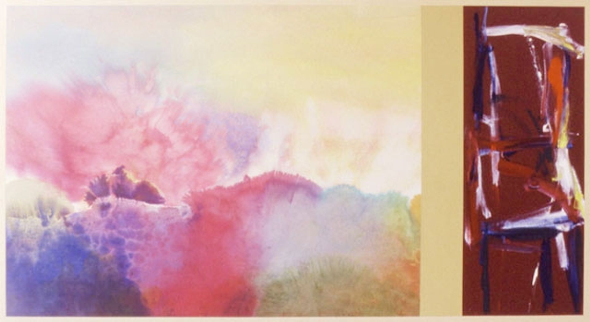
Ronnie Landfield made "For Sara Teasdale" using fluid washes of color, it's a dreamy dance of pigment meeting paper. The left side feels like watercolor clouds, bleeding into each other – pinks, purples, yellows. It's all soft edges, no harsh lines, giving the impression of endless space, like looking up at the sky through rose-tinted glasses. Then, BAM! On the right, a jolt of energy. Thick strokes of maroon, orange, and white crash into each other, forming an almost architectural structure. You can practically feel the artist wrestling with the paint, scraping and layering with abandon. The contrast between the two sides is what gets me. It's like a conversation between control and chaos, serenity and raw emotion. The loose washes on the left let the medium take control, whereas the right side demonstrates the will of the artist, making marks and constructing images out of pure gesture. I’m reminded of Helen Frankenthaler’s soak-stain paintings meeting Franz Kline’s bold abstractions – Landfield is playing with art history. Ultimately it proves the best art isn’t about answers; it’s about asking better questions.