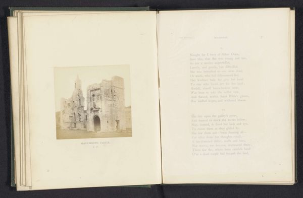
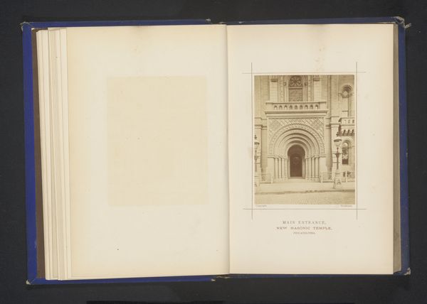
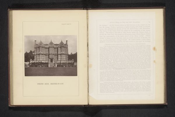
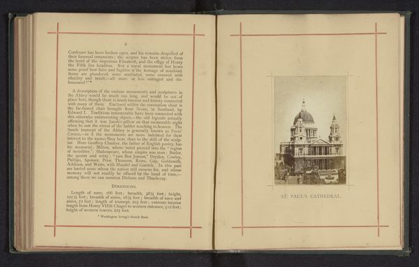
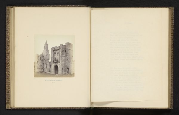
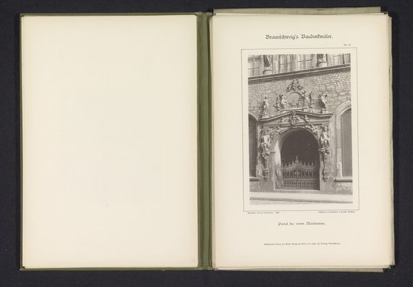
Gezicht op een façade in Deense stijl op de Wereldtentoonstelling van Parijs in 1878, ontworpen door Vilhelm Dahlerup Possibly 1878
0:00
0:00
photography, architecture
#
script typeface
#
aged paper
#
book binding
#
homemade paper
#
paperlike
#
photography
#
thick font
#
handwritten font
#
classical type
#
letter paper
#
architecture
#
historical font
Dimensions: height 201 mm, width 126 mm
Copyright: Rijks Museum: Open Domain
Curator: What a wonderfully preserved artifact. This is a page, likely from 1878, showcasing Vilhelm Dahlerup's Danish-style facade exhibited at the Paris World Fair. It appears to be a photographic print within a bound volume. Editor: My immediate response is drawn to the meticulous detail captured. The play of light and shadow across the architectural elements gives it a compelling sense of depth and solidity. The sepia tone adds an additional layer of warmth and historic depth. Curator: Absolutely. Dahlerup's design spoke to a particular moment in Danish national identity, eager to project a sense of cultural distinctiveness on a global stage. The fair itself was, of course, a site of complex power dynamics and colonial exhibition. It would be fascinating to consider the other national displays alongside this Danish facade, teasing out narratives of self-representation. Editor: It is the geometric arrangement of the facade itself that attracts my eye. The repetition of rectangular forms, the carefully balanced asymmetry, and the contrasting textures create a very harmonious whole. The embellishments never detract from the underlying form, only serve to enhance the visual experience. The classical type on the opposite page also forms a dialogue between architecture and literature in how the script reflects some of the geometric harmony as the print on the adjacent page. Curator: The use of a historicising architectural style itself is a deliberate act of cultural positioning. Dahlerup wasn't merely designing a facade, but evoking a lineage, constructing a visual argument about Danish history and its place in Europe, or even in the world order in general through cultural aesthetics. And in some ways that cultural order, while evoking beauty and refinement, played a role in rationalizing other non-Eurocentric societies as barbaric in comparison. The use of classical fonts and typefaces adds to that dialogue between beauty and its instrumental use as part of colonialism. Editor: And yet, isn’t there also a pure visual delight to be found here, a sense of aesthetic order that transcends its immediate political context? Perhaps this composition suggests how beauty, form, and line interact as elements of design as understood within Dahlerup's time? Curator: Perhaps. It's about holding both perspectives, understanding the visual power while interrogating its cultural work in the world. Editor: Indeed, the enduring allure of this Danish facade and its print perhaps resides in that complex interplay.
Comments
No comments
Be the first to comment and join the conversation on the ultimate creative platform.
More like this