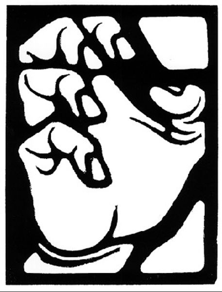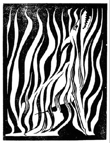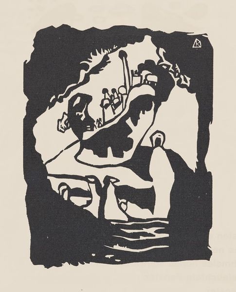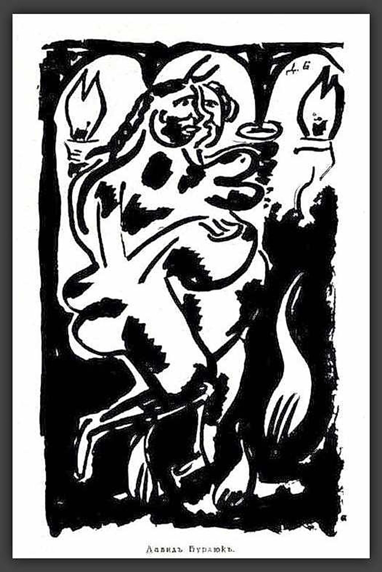
1915
Illustration for the almanac "Archer"
Listen to curator's interpretation
Curatorial notes
David Burliuk made this Illustration for the almanac "Archer" with what looks like woodblock or linocut, using stark black and white to create something both unsettling and strangely alive. Look closely, and you can see how the bold, raw marks carve out this figure, caught in a dance, maybe with flames licking at their heels, or are they feathers? The black ink feels thick, almost velvety, against the paper, giving the whole image a tactile quality, like you could reach out and feel the cut marks. Notice how Burliuk uses the white space, it's not just background, it's part of the action, defining the shapes and adding to the nervous energy of the piece. Burliuk’s later works often explode with colour, but here, the monochrome palette intensifies the emotional impact. He reminds me a bit of Kirchner, both drawn to primal expression, unafraid to let their feelings bleed onto the surface. It’s like they both understood that art isn't about answers, it's about the questions we dare to ask.