Copyright: Public Domain: Artvee
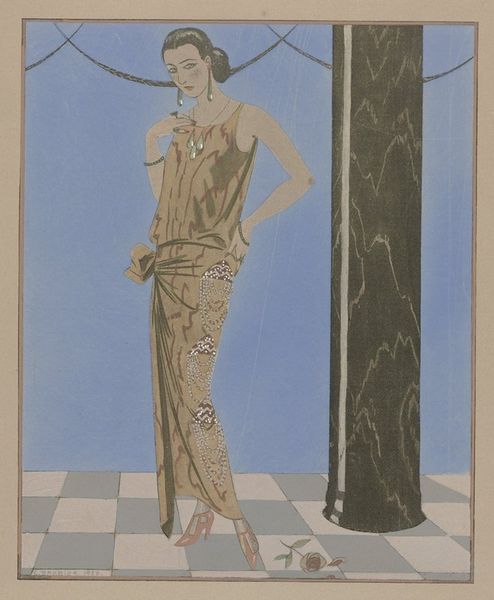
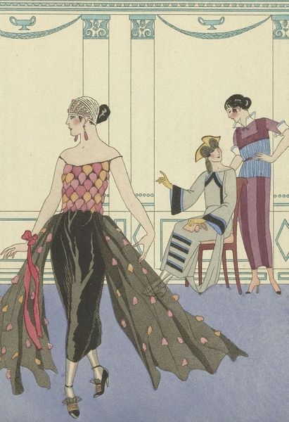
George Barbier made this print, Joie de vivre; Falbalas et Fanfreluches, sometime around the 1920s, and the first thing I notice is the bold, flat colors. It's like he’s not trying to hide how the thing was made, right? The charm of this piece lives in the materiality; it's ink on paper, pure and simple. Look at how the blocky floral patterns of the dresses contrast with the flat blue background and the cold, white pillars. It feels a little stagey, a little artificial, right? And, for me, that's part of the point. It’s like Barbier is showing us that artifice can be its own kind of real. I love the way the heavy black outlines define the figures, almost like a stained-glass window. It gives them a graphic punch, a real sense of presence. Barbier reminds me a little of Erté, another artist who was really into the decorative possibilities of printmaking. But, what I like about Barbier is that he doesn't take himself too seriously. It’s playful, chic, and has a lightness of touch, like a whispered secret.
Comments
No comments
Be the first to comment and join the conversation on the ultimate creative platform.
More like this