Dimensions: height 182 mm, width 269 mm
Copyright: Rijks Museum: Open Domain
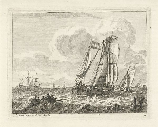
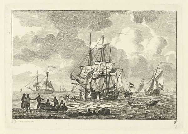
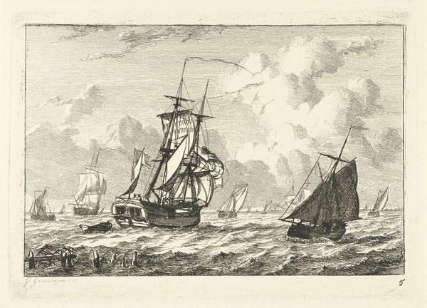
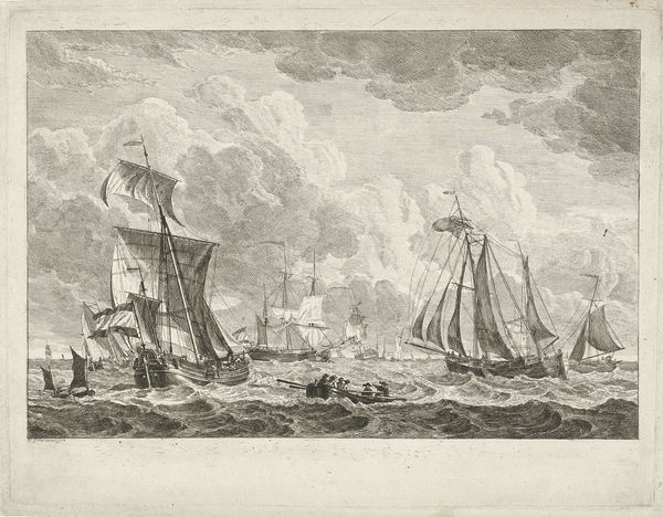
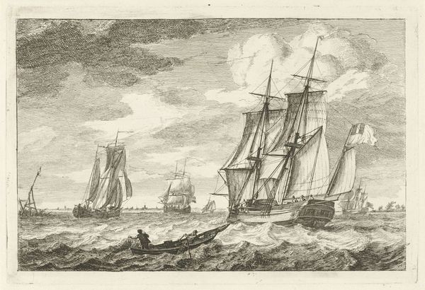
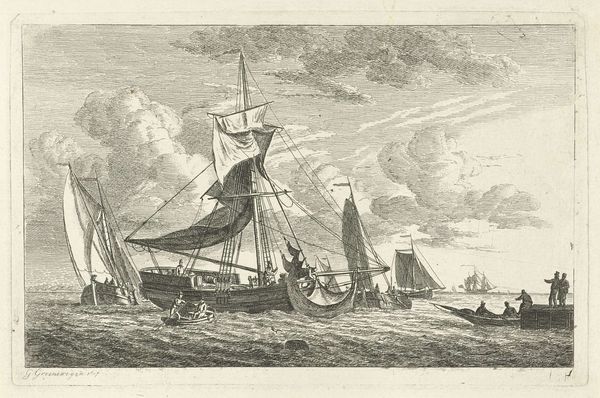
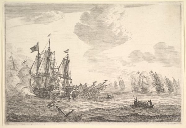
Curator: Gerrit Groenewegen's "Engelse tweemaster op woelig water," which translates to "English two-master on turbulent water," pre-dates 1793 and offers a captivating glimpse into maritime life. It’s currently held at the Rijksmuseum. What is your first take? Editor: There's a palpable sense of unease radiating from this engraving. The turbulent water immediately draws your eye, and despite the presence of multiple ships, there’s a feeling of isolation, a challenge to man versus nature. Curator: The dynamism is indeed remarkable. Groenewegen has masterfully captured movement, wouldn’t you say? Consider how he uses the engraving technique to delineate each wave, giving it both depth and texture. Notice, too, the angle of the ship's sails, catching the wind; all these details coalesce. Editor: And consider the broader implications! While technically impressive, who benefited from the maritime culture represented here? I am prompted to reflect on how these ships might connect to broader colonial ambitions. Was the 'turbulence' a symbol for greater political instability and the human cost of exploration and resource extraction? Curator: The artwork can also be approached as a celebration of Baroque artistry. There's a deliberate ordering in the way he presents depth through landscape techniques of aerial or atmospheric perspective—we perceive forms as more distant according to their clarity and color. He’s playing with visual conventions to establish not only depth but, in a way, knowledge, as perspective and form coincide. Editor: Knowledge perhaps rooted in power structures! As we analyze technique, let's acknowledge the context and how this period was built on uneven exchange and a deep legacy of exploitation. So, the drama of the sea can be reframed to reveal deeper unease in relation to the social order. Curator: It offers insight on Baroque aesthetics, if viewed for its mastery. The ability to suggest movement through static lines, that in and of itself makes a powerful aesthetic statement. It is indeed a beautiful object worthy of the museum. Editor: Fair enough. And even if unsettling, the print reminds us of our obligation to address the layered meanings of what a museum shares from the past with today's visitor. A pretty boat hides much deeper meanings.
Comments
No comments
Be the first to comment and join the conversation on the ultimate creative platform.
More like this