drawing, print, paper, ink
#
drawing
#
neoclacissism
# print
#
paper
#
ink
#
decorative-art
Dimensions: 9 1/4 x 16 1/4 in. (23.5 x 41.3 cm)
Copyright: Public Domain
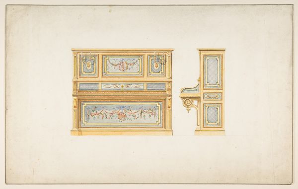
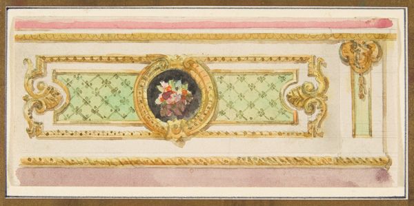
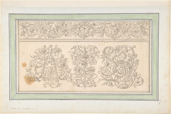
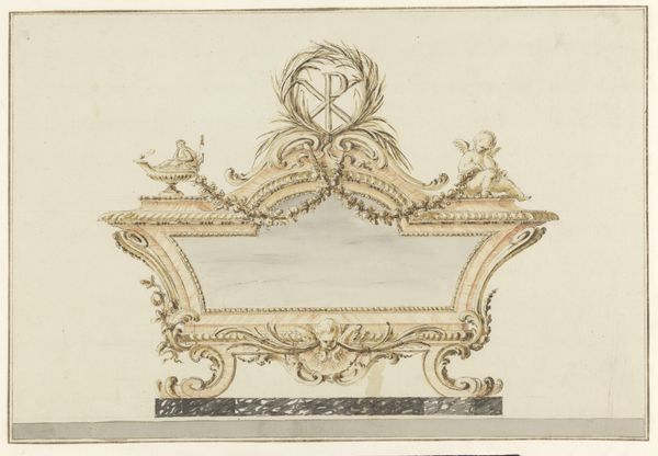
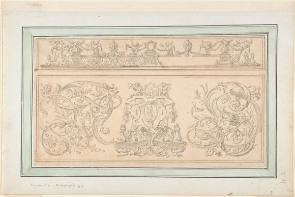
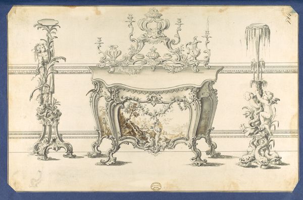
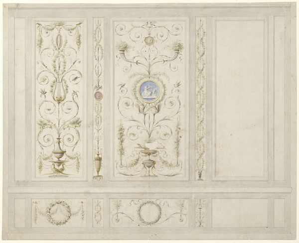
Editor: So, we're looking at "Designs for Door Hardware," dating from 1770 to 1790, from an anonymous artist. It's ink and print on paper. The detail is amazing! The patterns are so ornate, what's your read on this? Curator: The appeal lies precisely in that intricacy, doesn’t it? Notice the carefully delineated lines, the proportional relationships between the various elements. We see circles, ovals and rectangles creating the illusion of volume. The interplay of positive and negative space establishes a certain visual rhythm, no? Editor: Yes, it's definitely rhythmic. But the…blueness is almost overwhelming in contrast to the gold decorative flourishes. Is it just me or does the colour affect the way the forms sit on the paper? Curator: The colour is indeed impactful, serving not merely as a backdrop but an active formal element. Consider how the gold, through its texture and light, contrasts the smooth colour block, guiding our eyes around the various motifs. The success lies not just in individual form, but the relationship between the golden flourish and flat turquoise background, like musical counterpoint. Would you agree? Editor: Absolutely, the texture changes are super cool. It’s almost like a blueprint and a painting at the same time. Are the top motifs – the smaller ovals and circles – as carefully considered as the other flourishes or were they perhaps included later on in the design? Curator: Note their placement. They echo the shapes and decorative nature in the door fittings below, working in a clear compositional hierarchy. It provides unity, drawing our eyes back to the core elements. Without them, it would be a wholly different image, no? Editor: Yeah! Thinking about it that way makes a lot more sense. I didn't notice that initially, how the individual shapes were almost reflected above. I definitely see how they all tie in together now, even the blue and the gold. Curator: Precisely. It's in these formal relationships that the work finds its integrity and ultimate value.
Comments
No comments
Be the first to comment and join the conversation on the ultimate creative platform.
