print, photography
# print
#
photography
Copyright: Rijks Museum: Open Domain
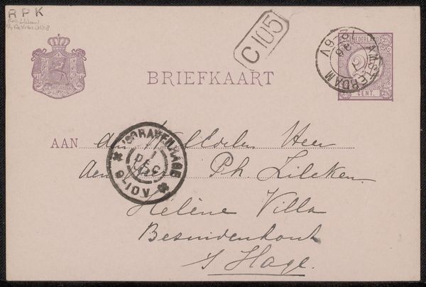
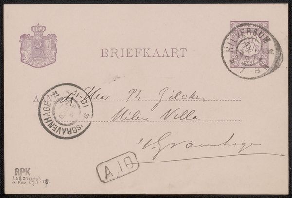
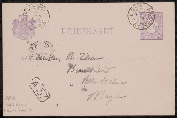
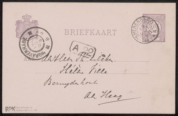
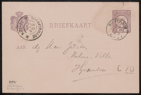
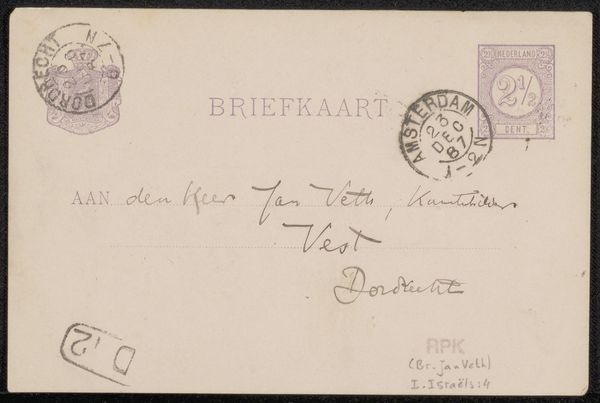
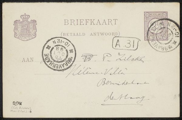
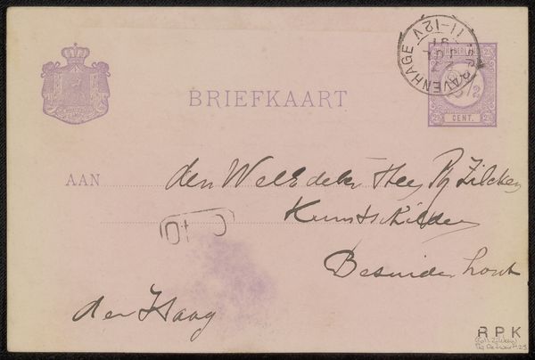
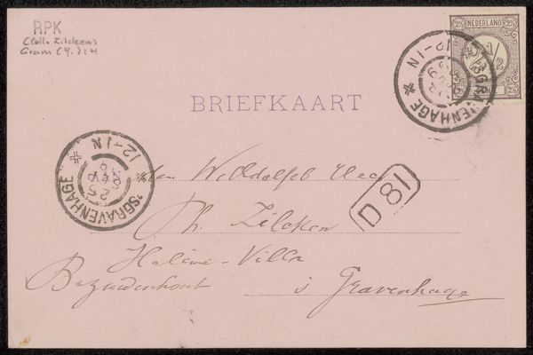
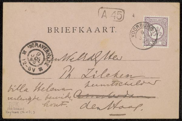
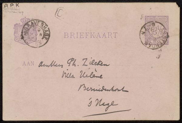
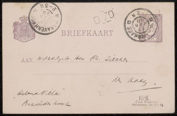
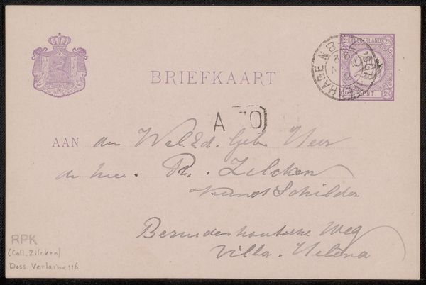
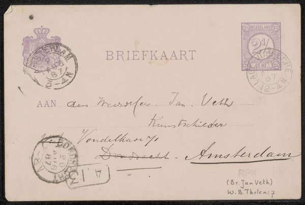
Editor: We’re looking at “Briefkaart aan Philip Zilcken,” dating back to before 1898. It’s a print and photograph from Jan de Waardt held at the Rijksmuseum. The first thing that strikes me is how much textual information there is – various stamps, an address. What catches your eye in this work? Curator: I'm intrigued by the formal relationships between the various graphic elements on this card. The stamps punctuate the composition with a dark visual rhythm, contrasting with the airy expanse of the card itself. Note the circular form echoed in the postal markings versus the rectangular frame of the card. Do you perceive how the stamps, although visually similar in hue, exhibit differences in their internal organization, enriching the texture? Editor: I do. I also noticed how the handwriting adds another layer, almost like an etching. Curator: Precisely. The contrast between the rigid, pre-printed text and the organic flow of the handwriting introduces a compelling tension. Furthermore, consider the subtle degradation of the paper, the minute imperfections. These aspects of materiality play an essential role. How might they impact our viewing experience, especially considering the historical weight implied by the work’s age? Editor: That makes sense. I guess I hadn’t really considered the intentionality of those details. The composition creates a historical artifact. Curator: Indeed. It’s through analyzing the artwork in terms of its texture and formal elements, while maintaining an awareness of its age that we grasp its visual significance and enduring appeal.
Comments
No comments
Be the first to comment and join the conversation on the ultimate creative platform.
More like this