painting, poster
#
portrait
#
art-nouveau
#
painting
#
caricature
#
caricature
#
cityscape
#
cartoon style
#
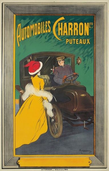
poster
#
portrait art
Copyright: Public Domain: Artvee
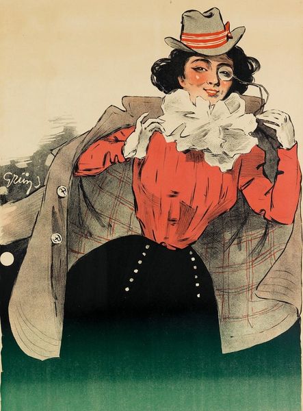
Editor: Here we have Leonetto Cappiello's "Projet d’affiche pour les automobiles Charron," dating from the early 1900s. The bold colors and simplified forms give it a striking, graphic quality. It seems very characteristic of advertising art from that era. What do you make of its visual composition? Curator: Precisely. Note how the artist employs flat planes of color—the vibrant yellow of the woman's dress, juxtaposed against the darker tones of the car and driver—to create immediate visual impact. The linear quality is further enhanced by the economy of line in defining forms. How do these elements serve the function of a poster design? Editor: I suppose the contrast helps it stand out, to quickly grab your attention. It is a very stylized approach! The perspective seems a bit skewed, almost like a cartoon. Curator: Observe the deliberate flattening of perspective, common in posters of that period. It foregrounds the image, pushing it towards the viewer. Consider how the shapes of the car and the figure are simplified and exaggerated. Notice also the texture is somewhat suppressed which is interesting. How do you think that flatness impacts its interpretation? Editor: I can see what you mean; the shapes almost become abstract in their simplicity. It feels very modern, and perhaps makes it timeless. Curator: Precisely. The work avoids representational accuracy for the sake of immediate communication and visual allure, features prevalent in advertisement during that period. And this creates the dynamism, even tension, the advertisement seeks to harness. Editor: That's fascinating; I hadn't considered how much formal analysis reveals about its intended function. It provides a fresh lens on how to see and assess the elements of visual design.
Comments
No comments
Be the first to comment and join the conversation on the ultimate creative platform.
More like this