c. 1910
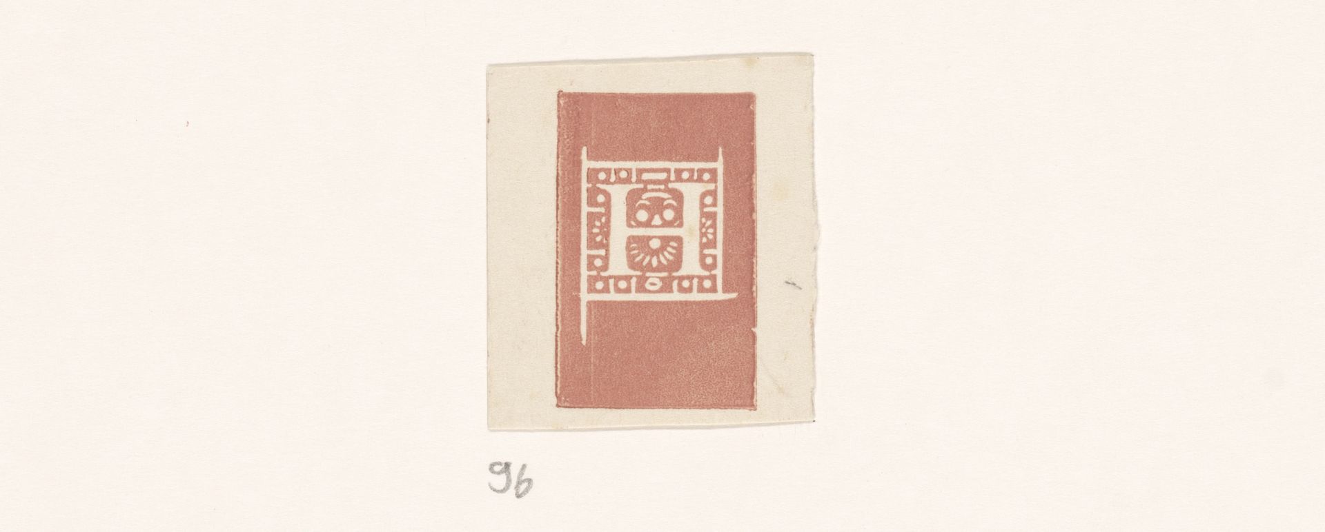
Letter H
Bernard Willem Wierink
1856 - 1939Location
RijksmuseumListen to curator's interpretation
Curatorial notes
Bernard Willem Wierink made this Letter H, a woodcut in color, at an unknown date. I love the way the image hovers between a letter and a kind of architectural façade. There’s a real contrast between the crispness of the lines and the slight imperfections in the inking process, giving it a handmade feel. I’m drawn to the limited color palette; the earthy red against the cream paper feels both modern and timeless. Notice how the negative space is just as important as the printed areas? Those little gaps and variations make the image breathe. This reminds me a little of Hilma af Klint’s symbolist works, where geometric forms are imbued with deeper meaning. Like Klint, Wierink uses simple shapes to create a sense of order, but there's also a playful quality, which keeps it from feeling too rigid. Ultimately, it’s the tension between control and accident that makes this little print so compelling.