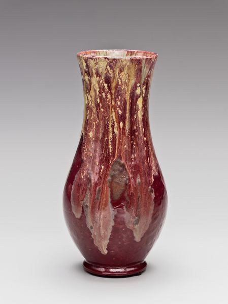
ceramic
#
art-nouveau
#
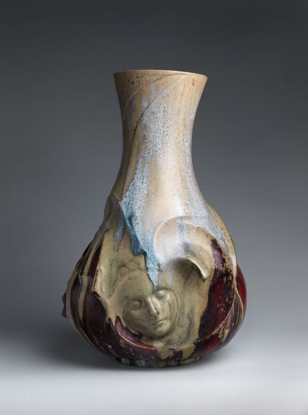
ceramic
#
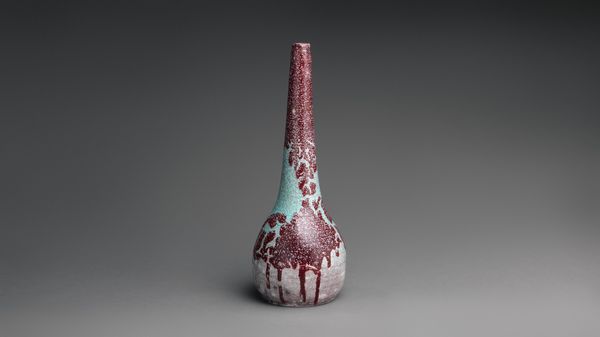
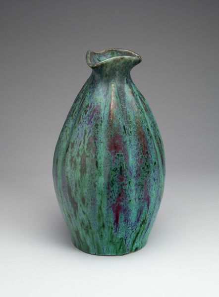
stoneware
#
ceramic
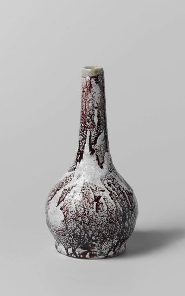
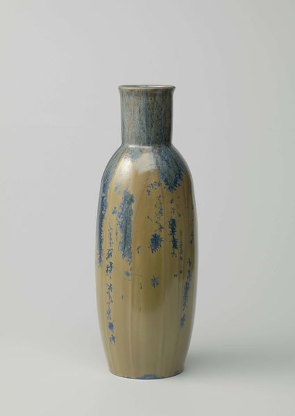
Dimensions: height 26.0 cm, diameter 12.4 cm
Copyright: Rijks Museum: Open Domain
This vase, by the ceramist J. Petersen, is covered in white, blue, and red glazes. It looks like Petersen was trying to capture something about the flow of liquid, or the way colors mix in unexpected ways when they run together, like watercolor. The vase itself feels heavy and substantial, but the glaze has these delicate drips and splatters, like the opposite of that feeling. The way the glaze is applied, thick in some spots and thin in others, you can almost imagine Petersen’s hand moving across the surface, tilting and turning the vase to let the glaze do its thing. It’s kind of an uncontrolled, unpredictable, and messy approach. The contrast between the dark glaze, that runs down the neck of the vase, and the splattered white underneath is really striking. It reminds me of the work of Lucio Fontana, another artist who was interested in the messy side of materials. Both artists leave a lot open to chance, and that’s what makes their work so exciting.
Comments
No comments
Be the first to comment and join the conversation on the ultimate creative platform.
More like this