drawing, coloured-pencil, watercolor
#
drawing
#
coloured-pencil
#
water colours
#
watercolor
#
coloured pencil
#
watercolour illustration
#
watercolor
#
realism
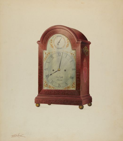
Dimensions: overall: 45.7 x 35.6 cm (18 x 14 in.) Original IAD Object: none given
Copyright: National Gallery of Art: CC0 1.0
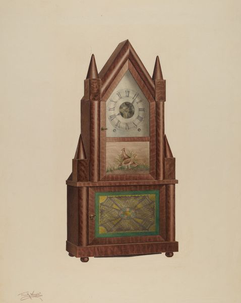
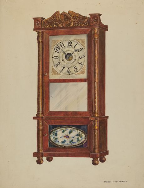
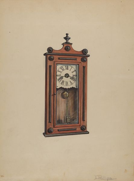
Curator: Let's have a closer look at this lovely drawing by Frank Wenger from around 1939, simply titled, "Shelf Clock," executed in watercolor and colored pencil. Editor: My immediate response is that it feels quite formal and rigid, despite being a drawing. The strong verticality, the symmetry... It projects an air of solemn authority. Curator: Absolutely. Consider clocks throughout history; they're not mere time-telling devices. They symbolize order, control, and even mortality. Here, the clock’s face, framed like a Gothic window, further suggests sacredness, aligning temporal measurement with religious structure. Editor: The medium complicates that reading, though. The delicacy of watercolor usually implies fleeting impressions, but here it’s used to depict a solid object with precision. The realism works against any potential symbolic subversion. Curator: Perhaps, but look closer. Wenger embellishes the clock face with abstracted, organic forms against the flat aqua of a pseudo-background. It's like seeing contained explosions of nature on each door and under the face—suggesting life pushes even within rigid systems. Those panels are quite peculiar against the strict geometry. Editor: You’re right, those decorative elements flanking the center create visual interest. However, it feels applied rather than integrated. Wenger seems to have rendered the clock’s form first, then layered on those decorative motifs almost as an afterthought. I wonder about that formal decision? Curator: Perhaps a statement on man's urge to embellish function with beauty? Or how nature reclaims what man makes over time? Even something so seemingly practical as time cannot contain our innate human drive toward organic aesthetics and our limited and failing attempts to do so. Editor: That's a generous reading. It strikes me more as an incomplete investigation. The materials themselves seem at odds—a clash of technique and texture, if you will. Curator: Possibly so. Whatever the case, I'm struck by the power of such a ubiquitous object carrying all this deeper meaning, even now. Editor: Indeed. There is more here, below the surface than meets the eye, wouldn't you say?
Comments
No comments
Be the first to comment and join the conversation on the ultimate creative platform.
More like this