graphic-art, typography
#
graphic-art
#
clean typography
#
typeface
#
bold font
#
type only
#
typeface variation
#
typography
#
eye-catchy type
#
thick font
#
pop-art
#
typography style
#
bold type
#
orange
#
sans serif type
Copyright: Richard Hamilton,Fair Use
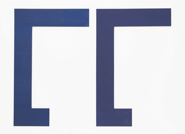
Richard Hamilton's ‘Epiphany’ hits you with its graphic punch and cheeky, almost subversive vibe. It looks like it could have been made using screenprinting, or maybe graphic design software. The flatness is intriguing. The colors, a strong blue against an orange ground, feel so deliberate, so Pop. It's like he's stripping away any sense of touch or gesture. I mean, look at that orange – so clean, so unapologetically itself. It's got this in-your-face quality, and it makes you wonder about the nature of language and art. Hamilton, with his cool detachment, reminds me a little of Ed Ruscha, another artist who loved to play with words and images. Both of them make me question what art can be, pushing boundaries and embracing ambiguity.
Comments
No comments
Be the first to comment and join the conversation on the ultimate creative platform.
More like this