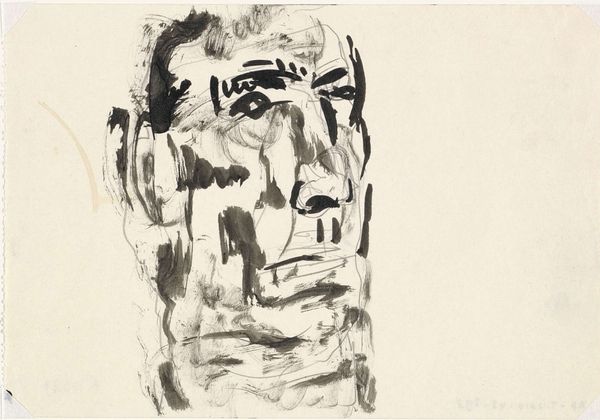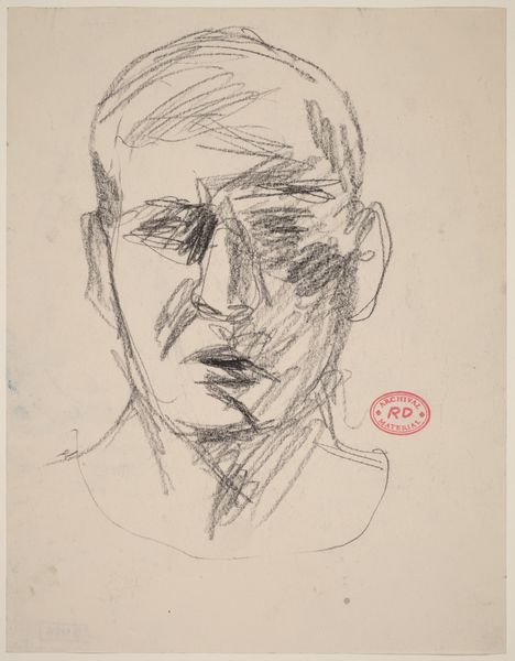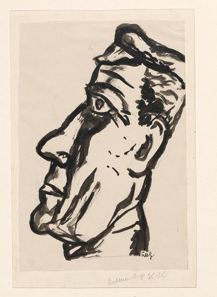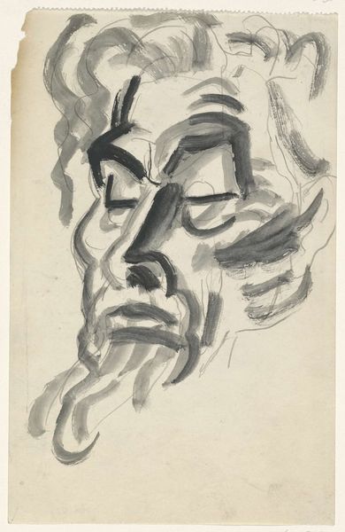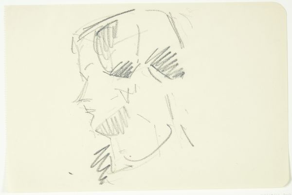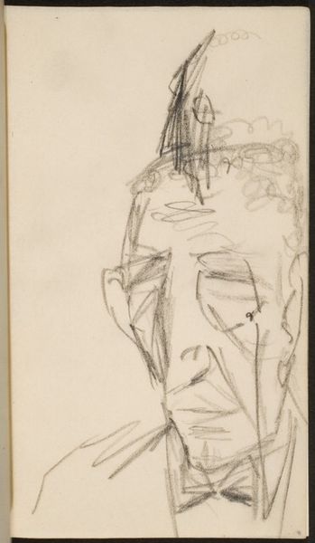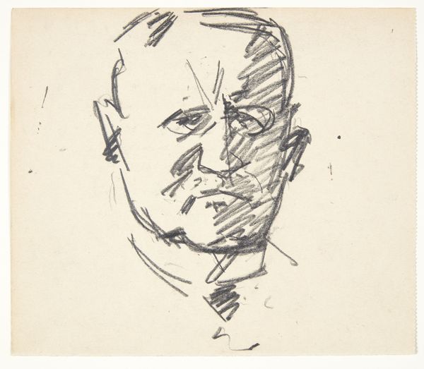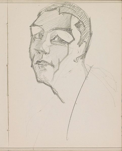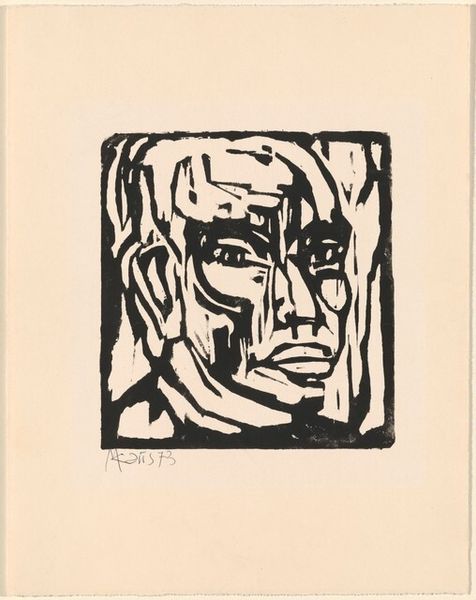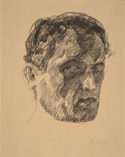
c. 1932 - 1933
Portret van man
Leo Gestel
1881 - 1941Location
RijksmuseumListen to curator's interpretation
Curatorial notes
Editor: This is Leo Gestel’s “Portret van man,” dating from around 1932 or 1933. It's a drawing done in ink, housed here at the Rijksmuseum. I'm immediately struck by its roughness. The lines are so bold and almost frantic. How do you interpret the artist's style and technique in conveying the subject? Curator: The formal elements here speak volumes. Notice how Gestel uses contrasting dark ink strokes against the stark white of the paper. This establishes a tension, a visual push and pull that activates the entire composition. The strategic use of hatching and cross-hatching creates depth and volume without relying on traditional shading techniques. It challenges the conventional portrait. Editor: It definitely does. It feels less about capturing a likeness and more about expressing something internal, wouldn’t you agree? Curator: Precisely. Consider how the distortion of the facial features, particularly the brow and jawline, deviates from classical ideals of beauty and harmony. Instead, the artist explores a more subjective, even fractured, representation. What effect does the rapid, almost impulsive, line work have on your reading of the sitter’s character? Editor: It suggests a sense of unease, perhaps even turmoil, but also strength. It’s not passive. This drawing uses a limited range of material means to achieve its visual effect and depth of content. I guess it invites one to consider expressionism’s focus on the emotional state of its subjects through a kind of modernist lens. Curator: Precisely, by understanding how these elements function autonomously we may observe a glimpse into the period. Editor: That's a really insightful perspective. I never considered how the technique itself could be such a powerful vehicle for expression. Thank you.