Dimensions: height 100 mm, width 160 mm
Copyright: Rijks Museum: Open Domain
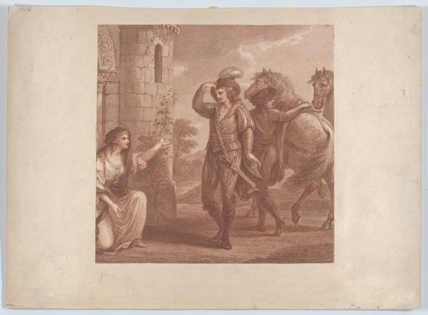
Curator: Here we have "Maagd van Orleans," or "Maid of Orleans," an engraving created around 1870 by Willem Steelink. Editor: What immediately strikes me is the high level of detail achieved with just black ink on what I assume is paper. There’s almost a photographic quality to the rendering of textures. But also, I feel a kind of historical distance, looking at the depiction. Curator: Well, it certainly evokes the Romantic era's interest in historical narratives. Consider the visual language – the central figure’s resolute stance, the protective gesture… These resonate deeply with pre-existing ideas of heroism and nationhood. And notice her garb, almost echoing centuries past… Editor: It's a staged drama, isn't it? The very act of printing and reprinting… Was Steelink making a statement about the industrialization of myth, taking something profound and mass-producing it through labor-intensive, yet ultimately reproducible means? It changes my feeling toward it, like a memorial or symbol used out of context. Curator: Perhaps. Or is he seeking to harness the power of that potent symbolism for his own time? Joan of Arc was already a resonant figure and invoking her spirit through reproductive technologies could suggest powerful messages, calling on French viewers of this engraving. Editor: So, what are we supposed to think or feel in 1870, confronting the mass manufacture and consumption of an image of Joan of Arc as reproduced and multiplied like this? Is it the promise of a unified identity under industrial forces? Or something else? Curator: These symbols always invite us into the arena of cultural memory and expectation. How does this image reflect a national longing? It offers not just an image of an icon but an emotional complex tied to historical ideas of her virtue. Editor: Considering this was printed and made for widespread viewing, you have to consider where and for whom, with such a powerful figure presented. Even though only two colors, black and white, are used in such detail with printing materials. It seems meant for wider circulation in many respects. Curator: Precisely. It all underscores the vital and active process of shaping cultural icons. It isn’t just the static image, but a dialogue across time, constantly evolving and reinterpreted with various intentions. Editor: A thought-provoking piece about material, labor, and production... even if its surface feels tied to history itself, even through the physical paper it’s been printed upon and dispersed!
Comments
No comments
Be the first to comment and join the conversation on the ultimate creative platform.